The next-generation personal finance planning service Tend, launched in Mexico and the United States this year, immediately burst into the market for this type of service and immediately aroused great interest. Unlike existing counterparts, the owners of the Tend platform relied on creativity from users and financial rewards for the latter. The bottom line is that after installing this product, the user and the developers will begin to adjust it to their personal needs. As a result, those who do not have access to programs provided by banks only for large and elite clients with large financial transactions will use it. These programs include a variety of financial rewards that are now also available to low-income groups using Tend.
A well-thought-out design, an original and attractive logo, as well as a name, the choice of which was not accidental, provided great support to the new platform in ensuring its recognition. Its meaning is fully consistent with the goals and objectives of the brand. All this is an achievement of the creative and creative design studio Gretel, which was able to reflect the spirit of the new service – a manifestation of concern for something other than one’s interests, the possibility of growth and progress only in close cooperation with each user.
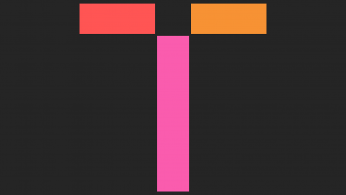
The portal logo is a great achievement of the developer. A system of three simple lines was created, which formed the first letter of the brand name – “T.” This badge is intended to symbolize the platform’s community that brings its members together in a common quest to get the most out of everything related to finance and its activities. It is designed so that it can be visually connected with any other lines in an infinite number of them, which symbolizes the ever-growing and intricately intertwined network of an ever-increasing number of community members. Each letter of the name is made in the first style – a symbolic one, which somewhat breaks the integrity of the visual perception of the logo. But serves the effect of easy memorization. The Pilat font from General Type Studio, used in the portal and advertising blocks design, adds warmth and to the overall pleasant atmosphere of the corporate identity.
The color gamut issue was resolved in a rather original way. The rejection of the traditional presentation of banking structures as strong and tendentious, selectively treating their customers only played to Tend’s advantage. It gained color and calm confidence thanks to its warm but vibrant color scheme compared to blue and black.


