Thanks to the busy 2020, it became clear that cardinal changes have taken place in the lives of many inhabitants of the planet. The coronavirus epidemic has sparked a huge demand for home entertainment. Brands have come to the fore by providing recreational activities emphasizing three key dimensions – affordability, ease of implementation, and participant distancing.
Therefore, LoL Esports, positioning itself as the flagship of digital sports from League of Legends, has hosted many tournaments with eSports teams on more than 30 TV and digital venues, presenting championship series in different parts of the world.
Like many other companies, the new brand identity is associated with the growing interest in esports and the digitalization of modern society. The adventurism’s magic, atmosphere, and spirit should convey a certain esports culture, a modern approach, new resources, and new horizons for expanding a niche.
The authors of the rebranding emphasize that sport has remained a sport; only its visual and technical component has changed in the current times.
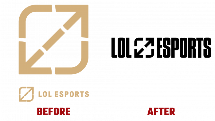
The Compacta font, which was previously used in the logo, remains in the new image. We can say that we have improved the shape and size of the constituent elements in the logo. Nearby, narrow, but at the same time, solid letters indicate the continuity of processes and the cohesion of the players. Although from a distance, the game icon looks like a digital image of a leaf for non-professionals; it means frames, the movement of the joystick back and forth. The image has more dynamics, a catchy accent, and rounded lines do not leave a feeling of loyalty, a willingness to surrender at a crucial moment. On the contrary, sharp corners and smooth contours are very organic.
The icon displays a gamer’s desire to win, to go further to the pinnacle of success in esports, a willingness to go back and help a friend, look back at past successful matches. The only disadvantage of the logo can be considered precisely the pasting of a square with arrows between two words of the brand name. This creates excessive visual saturation, but it is quite possible that the authors of the design decision to use this nuance as a feature of the company specifically. The bright ultramarine color and black letters create contrasting spots. Compared to the previous logo, where the brand name was almost solid and displayed in a mustard color on a black background, it looks like an alluring signal to get into the game faster.


