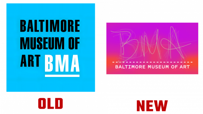
 The first major change since 2005 based on surveys and research.
The Baltimore Museum of Art has partnered with Topos Graphics + Post Typography. The result is a vibrant and colorful visual identity that can be found on digital and physical media.
Marketing executives conducted surveys of visitors, neighborhood residents, workers, volunteers, and tourists over four months to gain valuable insight into the BMA experience. The team wanted to know what motivates them to come to the museum, what is the most memorable thing they experience positively and negatively while visiting a museum. Thanks to this study, it was possible to identify four main features: brightness, honesty, fearlessness, and sensitivity.
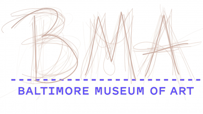
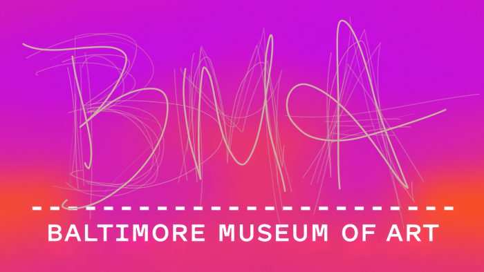
The new logo can be divided into two parts: at the bottom, there is a dotted line with the name The Baltimore Museum of Art, and at the top, the abbreviation of the museum. The line at the bottom of the image symbolizes the stage as a place for creativity. The abbreviation of the institution’s name is presented in the handwritten script of visitors and museum staff. The team set up iPads in the East Lobby and asked visitors to write the letters B, M, and A in a dedicated app. An unusual idea makes the logo stand out and adds uniqueness.
The color palette was inspired by the painting “Mischief” by artist William Sergeant Kendall. The artwork was the first present for the exhibition in 1914. As a result, the designers got an unusual yellow-brown hue. Additionally, orange-red, warm purple, and bright blue were added to the color palette. All colors embody boldness, brightness and add mischievous notes.


