As a non-governmental organization, The Circle makes great efforts to support the weak half of humanity in the fight against violence. Founded by songwriter and performer and philanthropist Annie Lenox, London, a UK-based organization seeks to expand economic opportunities. Through funding and effective support, this will allow not only to reduce the negative impact on those subjected to violence but also to end it by providing financial assistance to frontline organizations at the lowest level, directing funds to the most vulnerable countries in the world. The Company is proposing a range of long-term structural changes that will help address the root causes of these gender disparities and advance the fight for security and equity. Such a proposal is based on historical examples of how the unification of women makes it possible to realize their demands and lead to positive changes. The new brand identity facilitates this.
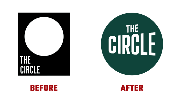
The circle shape, which symbolizes the unification of women in the new identity, has become the main graphic element. It highlights global actions in the brand’s core business. At the same time, the figure, in its interaction with other visualization elements, ensures that attention is attracted and the required information about the prospects and its progress is transmitted. The designers reflected the main principle – divine femininity in all its representations. This is both a feminist evolution of the three faces of the moon and a way of reflecting global feminism as the foundation of all aspects of the brand itself.
The new logo provided the conditions for emphasizing the textual name of the company used to create the logo. This ensured the thoughtful construction of the entire composition, the clarity of reading word marks, and fonts with a vertical increase in letters when a word is read from left to right. This form of “megaphone” successfully symbolizes the main purpose of the graphic image of the word, as the mouthpiece of a new visual language. An excellent graphical solution provides a visual perception of the text when viewing it from the letter “C” to the last letter “E” while enhancing the effect with the help of horizontal strokes of the last letter. The simplicity and high-quality execution of bold and concise letters make the text readable and easily scalable.
The dynamic execution of the logo taken out of the Circle with the change of signs after the text block and the change of colors in the module is especially attractive. The whole set of changing signs, based on the shape of a circle, provides visual diversity and signals an equally wide variety of problems that require different methods to solve.


