Team representatives met with fans, and The Crew decided to return the old logo – one of the fans’ favorites.
For the first time in the history of the Columbus Crew, the logo only lasted eight days. Representatives met with a group of fans at the legendary Crew Stadium to discuss the team’s rebranding. As you know, fans reacted negatively to the initial updates, especially the name change from Columbus Crew SC to Columbus SC.
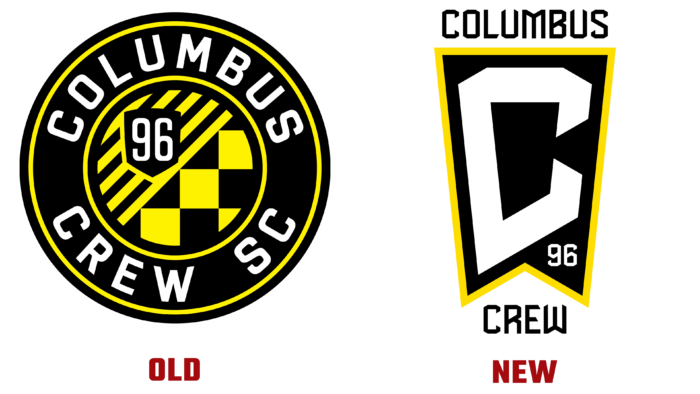
Soon after talking, the team decided not to change the name and change the main image. Instead of the triangle that flaunted in one of the corners of the logo, the number 96 is now placed as a symbol that the team was founded in 1969. The idea of the logo remained the original; only the name Crew is indicated instead of the SC abbreviation.
Despite user dissatisfaction, the team will continue to use the newly updated logo on all products as part of their branding. The logo is in the form of a flag with yellow borders. Inside the image is a large white letter C. The main color palette consists of contrasting colors: white, black, and yellow. The team is not completely abandoning the old round badge and will use it as a patch on the uniform.

Throughout the history of the Columbus Crew, the logo has changed four times. The third logo lasted only eight days, but it is not a record holder among sports teams. For example, the image and design of the 49ers helmets that the team wore in 1991 only lasted six days.


