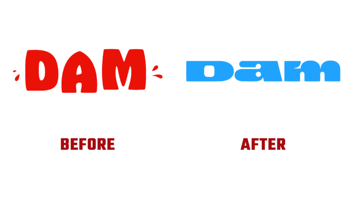
Modern trends have a huge impact on the offer of various production areas. This is especially true for food production, where there is an increasing demand for healthy, plant-based alternatives to animal fats. Dam, a Canadian company founded in 2020 that has renewed its visual identity today, is just such a company. It presents plant-based milk in concentrated form, requiring only the dilution of water and the immediate enjoyment of a unique taste without the presence of threats to one’s health. The brand sees as its main goal the struggle against the formation of surplus products pollution of the environment due to a large amount of used packaging and waste. This is done with the help of tiny bags, allowing for packing a small number of concentrates, which, when diluted with water, turn into liter portions. Packaging is also available in eco-friendly, reusable glass containers. All new developments and advantages, as well as changes in the development perspectives and strategies of the company, have been reflected in the new brand identity recently introduced to the consumer.
Dam’s visual identity has been developed with strict adherence to sustainable and successful development principles. The new-look has gained sophistication and a certain elegance with its obligatory usefulness for the consumer. Every element of the identity – whether it is a photo textual information, the design conveys all the core values simply and understandably, doing so elegantly and originally. Through this demonstration of them, the company has ensured that its product is attractive to those looking for a tasty and safe alternative to traditional dairy products. Being a solid substance that transforms into a liquid with the help of water, it inspired the creation of a wordmark in its logo with this effect. The mark reflected the unity of solid and liquid elements with its rigid and fluid lines, which was reflected in a modern minimalist style that became a symbol of the company’s zero-waste thinking.
Using only three letters in their text module, the designers gave each of them their distinct personalities, making only their width the same. Such strangeness evokes a sense of discomfort, but this works, especially in the Swiss-style typography, whose important characteristic is the ability to balance inconsistent things well. At the same time, the new visualization provides the viewer with an understanding of the brand’s main advantage – the use of 100% utilitarian packaging, which is especially relevant today.


