The world is so diverse and rich in its forms, types, and manifestations that it is impossible to create something similar to a person. Even the best team of advanced technologists, engineers, biologists, and other representatives of science could not design such a grandiose project as our tangible physical world in all its glory.
The On the EDGE Conservation brand positions itself as an organization that protects the rights of the diversity of nature stands on the principles of balancing the coexistence of wildlife and humans. Of particular interest to the foundation are rare and endangered species of animals that cannot protect themselves and protect themselves in any way in modern living conditions. These species at risk also include animals that are evolutionarily different; their nature is unique, and even family ties can hardly be found with other representatives of the fauna.
In short, the foundation postulates that we are contributing to projects that contribute to conserving some of the world’s lesser-known endangered species and help maintain the richness of nature.
Scientists and speakers, volunteers, and interns are all focused on working together for the good of Mother Nature. A noble mission, honor among colleagues, and respect among nature lovers – this is what brings this organization to a special level.
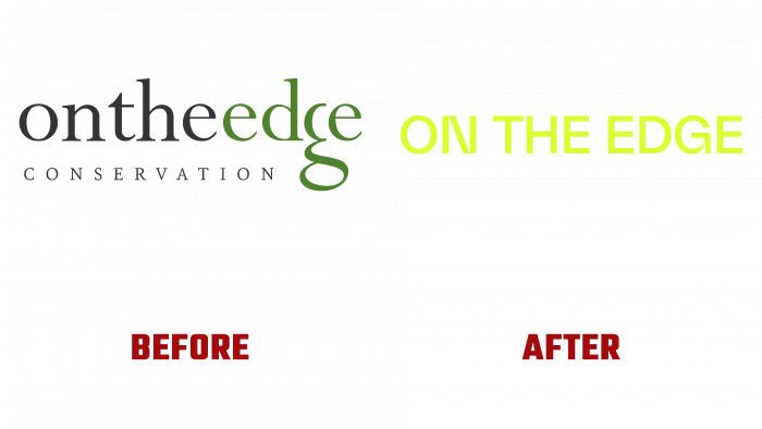
Recently it was decided to rename the foundation and make the logo simpler. It was difficult to say why it was done this way; perhaps to improve advertising and for a more fresh look, they chose the path to simplifying and digitalizing the appearance.
The fact is that earlier; the logo was a single whole – the verbal part of the name was written in one font, observing the correct distance between the letters, but without separating the parts of the words. It looked cumbersome, even though the font was chosen to be elegant and thin enough. Another highlight of the old logo was the green color of the last word in the fund’s name – “edge.” The letter “e” hid the “g.” Perhaps in this way, they wanted to show the attitude towards the fauna – a reference to the image of a reptile. Below is the postscript in capital letters CONSERVATION. The main color is black. It doesn’t distract from the serious intentions of the brand with its colorfulness.
The straightforwardness and laconicism of the new logo, which was created by the How & How agency, makes us take a fresh look at the problem of endangered species. If you don’t know what is behind the logo, you might think that this black-type logo refers to the press or a fashionable fashion brand. The logo looks good and is intriguing. In this case, special emphasis is placed on two letters – N and G. There are also spaces between the components of the logo; that is, the separating distance between words and the accented letters are specially designed thanks to the lines and the arrow in the case of the letter G.
With the appearance of the new logo and the truncation of the part in the brand name, there will be more interest in the fund, which is expected to attract more patrons and lovers of preserving precious wildlife in the future.


