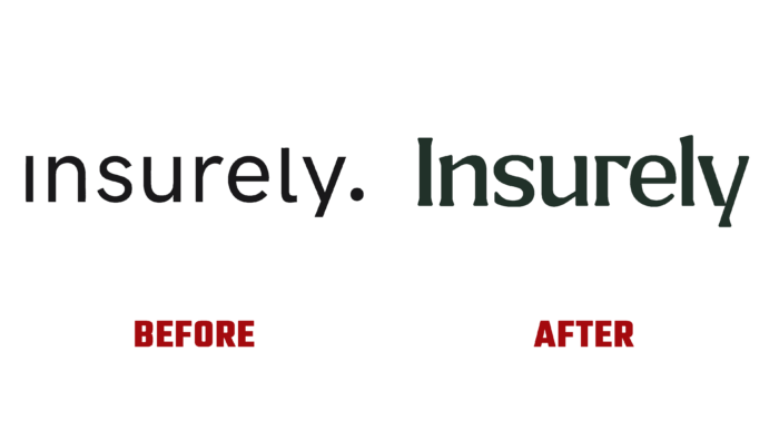
Insurely Insurance Company was founded in 2018 to create a new win-win insurance option. The brand saw the creation of a platform that would differ from similar services in its openness and clarity as to its main task. The result was a real breakthrough for both the owner and the provider. The development of the platform took into account the wishes of users. It was constantly supplemented with new products, with the help of which a win-win option was formed, based on the extensive practical experience of similar structures in the field of open data insurance. By accepting the Insurely offer, each user gains invaluable experience in using such resources, understanding all the nuances of insurance, which allows them to make the right and best choice in the future. All this was taken into account and taken as the basis for forming an attractive and informative visual brand identity.
Having set itself the goal of becoming a leader in the field of open insurance in a short time, the company paid special attention to its visualization. Using digital technology, the brand has created its design system, a unique visual voice, and a well-thought-out messaging hierarchy, based its strategy on transparency and openness. The visualization was created taking into account all points of contact for each of them to ensure the effectiveness of the interaction between the “host” and the “guest.” A three-dimensional world was created based on abstract data, an original open font of our design, and geometric shapes built on numerical indicators. These elements ensured that the service was connected to open data while retaining the intended dynamic playfulness and appeal. This background has become an effective compensation for the severity and dullness of the other categories.
The goal of the new identity was not to create a visual representation of the brand, which would attract not a direct connection with the direction of the brand but the “coolness” of its performance. The original font, which does not classify, was created using semi-flat characters with partial serifs. His letters “r” and “y” attract with their uniqueness and the effect of balance created by their mutual strangeness. The letter “s” immediately catches the eye with its heaviness due to the complexity of the upper bend. The letters stacked on top of each other, the rotated “I” resemble test tubes prepared for a centrifuge, which has no semantic connection with the brand itself—complemented by such a “chemical-pharmacological” aesthetics of active 3D graphics, creating an atmosphere of laboratory research. Enhance this feeling and the surrounding bizarre forms.


