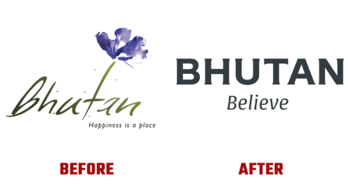
After two years of isolation, the legendary Kingdom of Bhutan is ready to welcome guests again. To create an attractive image, it redesigned the logo, guided by a progressive tourism strategy. Therefore, the country announced a modernized identity in early October this year. Although the details of the new branding have yet to be fully disclosed to the public, there is still some information about them.
The emblem, conceived as an ethnic symbol, is designed to demonstrate the development of the state and show the spirit of its optimism. It should arouse the population’s pride in the kingdom where they live and simultaneously strike the imagination of visitors. The result, obtained with the participation of the London studio MMBP & Associates, fully reflects the concept.
Everything is concentrated in the logo of Bhutan: the ambitions of the state, its history, landscapes, and character. Thanks to this, the design came out original, rich, bright, and bold. Thus, the current embodiment of the country’s heritage paves the way for the future. The developers creatively rethought national motifs and created modernized icons with digital precision – dynamic but traditional.
The identity was based on four animals from Buddhist mythology, stylized in the spirit of local folklore. They were specially adapted for a computer format. The “stars” and ornaments surrounding them are classic decorations of the Kingdom of Bhutan. They are rebuilt, rethought, and presented as a continuous decorative pattern. It is like an interpretation of the night sky full of mesmerizing constellations. Using an imaginary telescope, every guest of the country can see something charming and pleasant in abstraction.
As for color, it is also symbolic. The main palette is taken from the country’s national flag and combined with a range inspired by the local nature. The base is yellow and orange, and the addition is green (cypress), blue (Himalayan poppy), and black (soot from fires). This “iconography” echoes not only the new system of graphic identity but also ancient folklore, myth-making, and folk painting.
The emblem turned out to be clear and modern, embodying a confident and courageous country that reflects the far-sighted spirit of the people. The designers have adorned it with a two-level “Bhutan Believe” inscription and optimized it for most of the formats that are used in the digital world.


