 The oldest British pharmaceutical conglomerate has announced the creation of its new GSK brand, whose identity accurately reflects the current changes. Remaining “true” to its traditions, which began in the 19th century, it continues to develop and expand, absorbing other companies. Today’s changes result from a merger that began in 2000 with Glaxo Wellcome and SmithKline Beecham. Known for its high-tech production of vaccines such as malaria, medicines, and health products such as Aquafresh toothpaste, the brand continues to work on expanding the range, increasing capacity, and increasing the reach of potential consumers. The new brand was launched in 2022 after Wolff Olins developed an advertising program and identity.
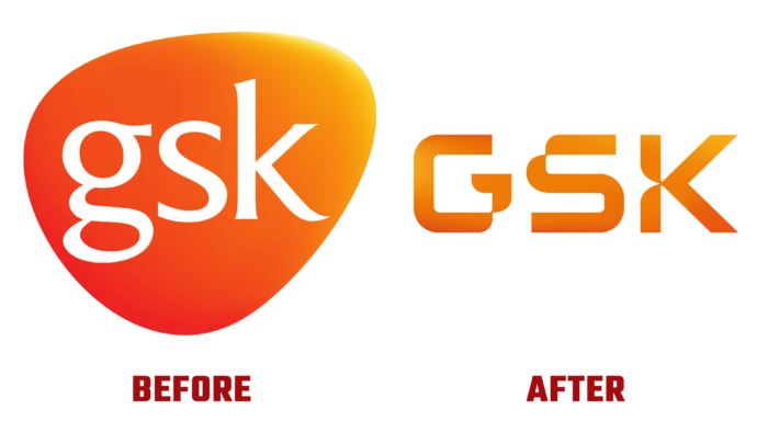
The modern brand is fundamentally different from its predecessor. First of all, it touched on the global context. First, the identity began to focus on biopharmaceuticals as a leading direction. A new goal was reflected – the unification of science and technology, backed by employees’ talents to work ahead of the disease, highlighting the consumer direction in a separate company. The new design reflects GSK’s biggest change in 20 years, its current strategy, voice, and culture. An important point was the desire to apply the latest developments and innovations, which is supported by an ambitious approach to treatment methods and patient needs, investors’ expectations, and team members’ desires.
The update was more a reflection of the scientific focus. Graphics acquired geometric accuracy and clarity of lines. The letters are individually tucked to give the design the appearance of high-end lab equipment with elegant and delicate levers. The letter K – like an anchor, stops the eye, and G and S have “catchy” corners.
Visual efficiency and appeal were achieved by animating DNA strands, the main element of identity. This was facilitated by 3-D technology and fruitful work with the color palette – the use of bright orange, pink and purple shades on a white background. The result was an accurate transfer of the brand’s main idea without creating kicking pandemic features, which acquired all the necessary properties for high-quality reflection both in print and digital.


