Tipser is a large company that is an enterprise platform for embedded commerce. It helps to make a purchase quickly and easily at the moment of inspiration or shopaholic mood without problems and unnecessary movements. Large brands cooperate with it, and the company itself positions itself as an innovative market. Even publishers are working with Tipser to monetize their content.
As a result, the company, covering a large audience of 200 million users at least in the publishing network, has a product catalog consisting of 1 million products from 7 thousand world brands. With offices in different cities (Stockholm, Wroclaw, Barcelona, and New York), Tipser is constantly expanding into new markets, expanding the horizons of embedded commerce.
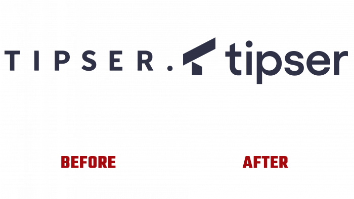
Looking at the old logo, it becomes clear that only loyal fans of the brand or users and potential partners unfamiliar with the company’s potential can endure such visual boredom. And then, perhaps, looking at the identity, the latter would hardly have fired up the idea of making a revolution in e-commerce.
And the revolution of consciousness and the acquisition of new meanings occurred simultaneously with the determination of the vector of the company’s activities. We decided to take the audience by scale, hoping for a bright future and the company’s versatility.
In this regard, a new logo appears, which has a neat, restrained appearance. The logo consists of modest dark elements – the symbol itself, which denotes the brand, and rounded letters in a simple font with a lowercase letter.
But how beautiful and graceful the stylization of the letter T in the form of a telescope looks! The T symbol is created from an abstraction of the shape of a telescope. It conveys the idea of a constant search and the brand’s endless thirst for discoveries and expansion of its universe. This innovation, sophistication, – laconicism, which perfectly reflects the essence of the brand.
There is no need to invent something – everything is extremely clear and as beautiful as possible.
The visual range of illustrations, colors, which were chosen as the leading ones, convey the simplicity and sincerity of the brand. Soft lilac, orange, blue, light tones, and spherical gradient shapes convey softness and care for users. The theme of space, stream, the nebula is preserved for the entire range of visuals.
In advertisements, printed products, on the website, you can see the main idea everywhere: our commerce is space.
Thus, the brand presented its identity as a rich world, encompassing nearby spaces, sucking into its by no means black holes of shopping.
To the layman, the current creative vision may seem somewhat futuristic, obscure, and ghostly. But this is only at first glance. After all, as soon as the user gets acquainted with the platform’s features, everything strange becomes close and familiar – something that the buyer always expects.
Such brevity and open simplicity is the main advantage of Tipser – the unobtrusiveness of the brand, which attracts customers.
And the elegant new look, like a black veil on a lady, emphasizes aesthetics, straightforward character, and spontaneity.


