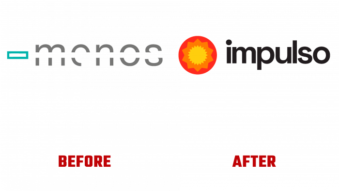
The Menos organization decided to drastically change its name and identity because, in August last year, it concluded that the business needed to be raised to a new level. To better reflect the brand’s activities, of course, it is necessary to transform your identity completely.
Now this company has received the name Impulso. The company promotes business development in various formats using various programs aimed at supporting entrepreneurship.
The energy with which the company’s employees take on a new case seems to have escaped and swept the space around. It was a powerful wave of enthusiasm and activity that the designers wanted to show in a new visual image.
Thus, the key elements and concepts of the new design are energy, playfulness, humanity as three pillars on which business is based.
The three goals that the designers pursued are very close to the layman:
- The brand identity should express humanity and kindness through energy and activity.
- Entrepreneurs are seen as heroes of the new era who fight against monsters that devour profits, time resources, and business enthusiasm.
- It is a fact that the design must have a well-built communication line to be as close as possible to the target audience and to be a communicating mechanism for the entire organization as a whole.
Three programs correspond to this – Ignição (ignition), Propulsão (movement), and Expansão (expansion). Each is selected for a specific client, a novice businessman, or ready-made seasoned business aces eager to expand.
Therefore, the appropriate symbolic graphic images were chosen – yellow and orange stars and a red circle according to the expansion concept.
The company is based in Portugal, so we can say that such sunny and eye-pleasing looks reflect the cultural characteristics of the brand.
The brand’s name is made in a regular font without any inventions, only with the only feature that without a capital letter.
In general, the logo and the new identity look very organic and positive, as if setting up potential customers at a distance that nothing bad will happen to their business. Still, there will only be increased demand, attention, and respect for the target audience.
As planned by the owners of Impulso, the new design is a completely new way of looking at the business and its prospects. Therefore, we can say that with a new image, the company makes new acquaintances with the audience, talking about possible prospects and expanding the horizons of entrepreneurship – a successful example of high-quality rebranding and further business promotion along the lines of creativity.


