Among the various organizations working in the area of collaborative action against AIDS, the International AIDS Society (IAS) is one of the leading ones. Founded in 1988 in Stockholm, Sweden, today the company is headquartered in Geneva, Switzerland, which has become a necessity in connection with the development of the brand and its expansion outside the country. Its members come from over 170 countries, including medical professionals, developers and service providers, patients, and politicians. The company’s mission is to reduce the global impact of HIV through medical interventions and the collective advocacy of all stakeholders. Founded to provide legal protection for those affected by HIV, the organization is the world’s largest association of experts in this field. To enhance the effectiveness of actions, the brand is constantly evolving, expanding its influence and capabilities, which requires changes in its visual identity. Following this challenge and striving to match today’s characteristics, the company conducted a deep analysis of its activities and created a new design that is distinguished by the presence of a strong common visual language with a minimalist approach.
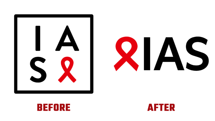
The new logo has retained its direct connection to its history by retaining its core elements – the familiar red ribbon symbol of the fight against HIV. It has become a binding symbol for all divisions and sub-brands. The tape has acquired an enlarged loop in its graphic design, which contributes to its better visual perception. The changes also affected the architecture of the brand. Text block – the abbreviation of the name is located horizontally and follows immediately after the symbol. The new identity uses a customizable corporate font that promotes simplicity and ease of bringing together the brand’s strongest points. As in the previous version, the abbreviation is made in black, which contrasts favorably against the background of a bright red symbolic sign. The letter A “rubbed” its “sharpness,” having received a cut-off top. Letter S has become more rounded. These graphical changes added to the attractiveness of the logo, making the identifier easy to read and remember.
The absence of unnecessary visual overload and the new logo configuration made it easier to get acquainted with the brand identity, ensuring that it is fully in line with modern trends.


