Brand strategy and design agency RichardsDee has developed a new visual identity and strategy for Fáilte Ireland – Ireland’s National Tourism Development Authority. Since 2003, Fáilte Ireland has been responsible for the prosperity and stability of Irish tourism, which plays an important role in the country’s economy. Since its inception, the Office has made every effort to create a unified focus for all representatives of this industry in the country. All conditions were created for harmonious joint activities with commercial and public tourism organizations to achieve the required goals. Today, the department’s activities have ensured a constant increase in profits and the successful development of all directions in the field of tourism. Thanks to this, new jobs have been created, the effectiveness of actions in environmental protection has increased, which is one of the most important tasks.
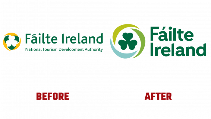
The new visual identity of Fáilte, Ireland, reflects all the current changes and advances in the tourism sector. With its help, the evolutionary role of the organization, its fundamental values, representing the Office as a reliable and leading organization, was effectively presented. The company emblem was built around an accent element – the traditional shamrock, which has become the main symbol of tourism in Ireland. The font of the logo text has also been modernized. Changes were made to the color scheme of the visual identity, which ensured harmony and appeal while paying homage to the organization’s history.
The accent element, the trefoil, has acquired a clear form, softness, and visual warmth. Its modern image is based on the classic version from Bord Fáilte of the 60s of the last century. Around it was created a circle of three elements of different colors, which symbolize the three basic elements of tourism – earth, air, water (sea). At the same time, this combination also conveys the main essence of the organization – demonstrating the unity of three important aspects, among which are communities, customers, and partners.
The integration of green gave the logo a positive boost. The shape of the circle, which can be seen as a symbolic rendition of the Mobius sign, has provided an element of vitality, which effectively reflects the dynamism of the entire tourist destination. The font used in the logo was selected for its versatility, the ability to easily and easily integrate it into regional brands. Made in shamrock color, it creates the impression of unity and harmony in the entire composition. Placing two words above and aligning them to the left made the entire logo composition legible and easy to remember.


