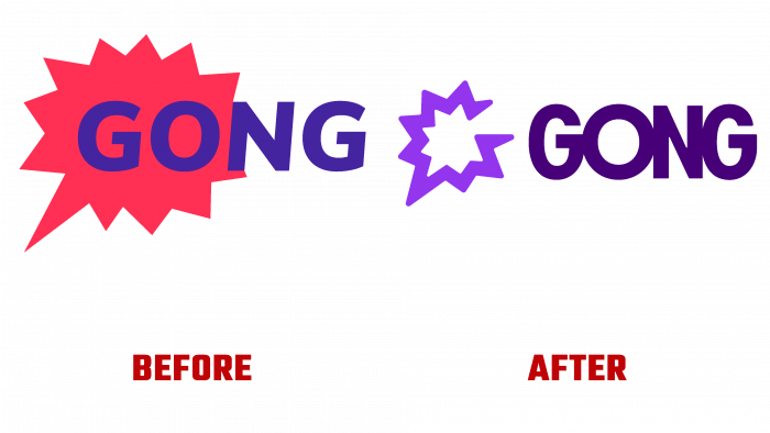
The Gong Platform (CRM), developed for customer relationship management, has changed its visual identity. The Moving Brands studio developed a new identity. Modernity requires meeting the requirements of time and technology. The correct approach to your own visualization guarantees success in the modern world. The platform created based on artificial intelligence captures and “understands” every interaction with the client. Based on the data she receives, she conducts analytics, which allows her to make decisions based on data but not opinions. Based in Tel-Aviv, Israel, and headquartered in San Francisco, CA, the company has 700 employees. The platform’s capabilities are used today by more than 2,000 enterprises and companies: PayPal, LinkedIn, Shopify, Slack, and Zillow.
The main task of Gong is to collect data on income. Today, the platform presents to the general public data showing the growth in the number of attracted clients from a wide variety of industries and corporations. Among the important innovations that led to rebranding was a formalized mission to help clients unleash their potential. The updated corporate identity more accurately reflects the company’s growing scale while simultaneously expanding the tasks set. All of this is giving new impetus to global corporate clients.
The new logo is a gong – special, original, unexpected in its graphics and voice acting. The resonant sound of the first loud “explosion” doubles as the letter “G.” The icon takes on a rather funny look. One gets the impression that it is being detected exactly at the moment the Gong is triggered. The visualization of the wordmark is very well executed. It is easy to remember and easy to read at any scale. The combination of a word and a sign looks very impressive. Thanks to the thoughtful use of color in the logo, the visual integrity of the graphics were achieved. At the same time, the brand’s inherent personality was highlighted.
The text is in BN Axel Grotesk by Brandon Nickerson, which is playful with enough seriousness. This font has very effective “O” letters with smooth curves, which is very consistent with the features of the logo itself. The auxiliary font, Messina Sans by Luzi Type, used in applications, also looks very good.


