In the wake of the flourishing of visual creativity, the city of Freiburg has stocked up with a new logo. And why not, if the cold weather is coming now, there is nothing to warm the hearts of visuals, except for the beauty of the graphic images of the beloved city?
The city’s new tourism brand has recently been introduced in Freiburg, sparking a wave of negative comments about the cost of the new visitor center.
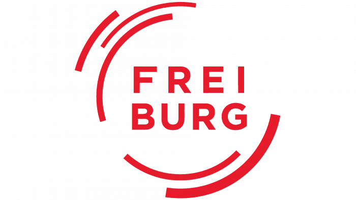
The fact is that the amount of 200 thousand euros for the futuristic circular logo in red with an inscription in two lines, which is now used by the main tourism site of the region, raises doubts not only among ordinary people but also outsiders.
The main idea associated with the rebranding is focusing on offering travel services in one beautiful place – Freiburg. And by proposing a new logo, there is an idea to approve the position of the tourist center.
Data from the city’s economic development agency indicate that the new logo is indicative of a “calm city life,” “ambitious people,” a “natural balance” between the city’s urbanism and the nature of Freiburg.
Analysis of the city’s identity made it possible to choose a concept for implementing the logo. I wanted to show the economic factor, the prosperity of the region, sustainable growth, focus on development, and the beauty of the city itself, aesthetics, and confidence.
What is so interesting about the logo? Round lines, in the center, there is an inscription bifurcated in half – FREI and BURG.
It seems like life around the city happens either in waves or in circles.
Symbolic, futuristic, with a bright red accent. In the future, it will be possible to judge whether such a new image will attract tourists or it would be better to do something more expressive.


