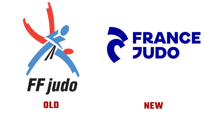
Recently, the French Judo Federation announced a name change and introduced a new symbol of the organization. Now the Federation will be called France Judo, which provided ease of reading, making the name short and resonant and made it possible to more accurately convey the semantic meaning of the structure, bringing to the fore the importance of the team rather than organizational and legal institutions. Modernity and simplicity are the basis for the rebranding of the sports association.
Experienced specialists from 4uatre were involved in developing the new logo France Judo, who helped to realize the main idea of the organization. The stylized image of the main techniques of this type of wrestling – capture and throw and the original choice of the main color made the logo especially unique. The symbiosis of two elements on the common monochrome of the new creative color scheme of the emblem – Klein Blue ensured the unity and harmony of perception, the required visual balance. Thus, the designers provided an opportunity to pay tribute to the Great Yves Klein – the first European judoka to receive a black belt and an unrivaled artist who managed to change the course of art with just one color. This belated recognition of his achievements as an athlete, which the French Judo Federation ignored during his lifetime.
On the eve of the Tokyo Olympics, France Judo, one of the largest sports associations in terms of its members – more than 550,000 members, announced a complete change in the symbols and logos of all national teams. Now French judo has become the owner of the emblem that most accurately embodies the principles and philosophy of such a sport as judo, which can significantly increase its recognition and popularity.
The association’s logo has acquired its current form thanks to the conduct of mass polls and consultations. A simplified, stylized image of two wrestlers allowed us to abandon the descriptive load characteristic of the past symbolism. The new approach to creating the image created a unique visualization of the very process of movement, the moment of throwing, which is one of the most important judo techniques – Nage Waza.
As a result, a laconic and unique design was created, which demonstrates a deep rethinking of the organizers and members of France Judo of their internal attitude, both to the sport itself and to the way it is presented to others.


