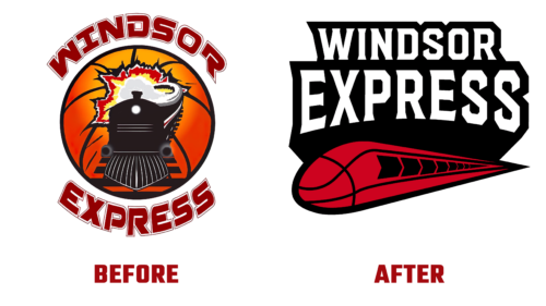
Canadian professional basketball club Windsor Express announced on October 20 a major rebranding that will allow it to move confidently into the future. With the help of a change of image, he wants to transform for the next ten years completely. Everything will be changed: logo, uniform, and official web resource. This means that the franchise, part of the NBLC, will begin to position itself in a new way.
This was announced by Dartis Willis – the executive director and president of the team. He also said that the process starts with the logo. It will be the first to be upgraded and will demonstrate the high speed, determination, unshakable power, and unconditional strength of the athletes. The emblem will also emphasize the internal motivation of the players to achieve new victories, show their dynamics, and reveal the boundaries of the future.
The basis of the visual identity of Windsor Express will be a real express train. It will be a luxury train, modern and fast. Designers stylized a basketball for it. They played with the lines in an interesting way, turning them into elements of a locomotive, which usually drives trains of cars. The dark stripes blend harmoniously from the ball to the train, highlighting its nose, top and bottom. The windows are wide dark arrows.
That is, the developers have combined three factors in the new emblem:
- The team’s name.
- The internal mood to win.
- The similarity of the ball in flight with a fast-moving locomotive.
The sharp lines depicted at the end add to the logo a sense of movement – that the ball is thrown and flies along the chosen trajectory, taking the form of an exquisite liner. As Willis noted, Windsor Express is already up and running and heading into the new decade.
The inscription is made in curly letters with points, smoothly turning into serifs. At the same time, the glyphs have a lot of edges because the corners are cut off. And such a dynamic font goes well with a train rushing forward at full speed. A rich red pattern and a white wordmark are on a common black base, which, due to its shape and unbroken light outline, looks like a fashion patch for clothes.


