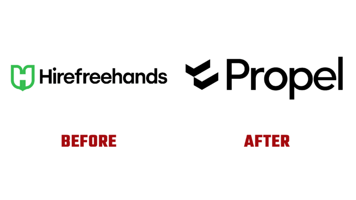
Formerly known as Hirefreehands and now completely rebranded under the new name Propel, the company’s main task was to assist in the recruitment of African technicians. By exploring emerging markets, the brand helps to find world-class professionals who are willing to offer their skills, knowledge, and skills for appropriate remuneration, where their experience and talents can be appreciated. The platform, the motto of which is Community-as-a-Service, provides such opportunities, practically reducing the search time for both offers and specialists to zero. Its future ecosystem is built on the completeness and accuracy of the available data, making it the most efficient service. A wide range of offers allows you to find full-time or remote jobs, as well as convenient hybrid options. The brand is currently forming the largest unified community of technology ecosystems in Africa. Thanks to this, the company provides an opportunity for real talents to have free access to job offers, built-in finance, and other benefits that become available to every member of the community. Such attractive prospects required a radical change in the brand identity.
The first step was creating a new name, which was a true reflection of an important feature of the organization – its constant movement. Propel has focused its attention specifically on promising emerging markets, which contain the huge potential for further development. Thus, the company has demonstrated its readiness to support the forward movement of both enterprises looking for qualified personnel and the specialists themselves. The change of name gave rise to further changes in the company’s identity. Her new logo is an example of modern trends. The rejection of visual elements that overload the image ensured that the text block was easy to remember and read. By using an original and simple image as a symbolic sign, in which you can see two checkmarks from the questionnaire when concluding an employment agreement and two rectangular foundation blocks, the brand effectively reflected its goals and objectives: checkmarks – a symbol of a service related to employment or recruitment assistance. Blocks reflect the stability and sustainability that will become available to both the enterprise and specialists when using Propel services.
The name in the logo is made in a confident and visually stable font. The optimal thickness, lack of serifs, and roundness of the letters are all aimed at building confidence among users in the success of cooperation, the stability of the company, and the seriousness of its proposals. The black color chosen as the main color enhances this effect, attracting attention with its rigor and confident certainty.


