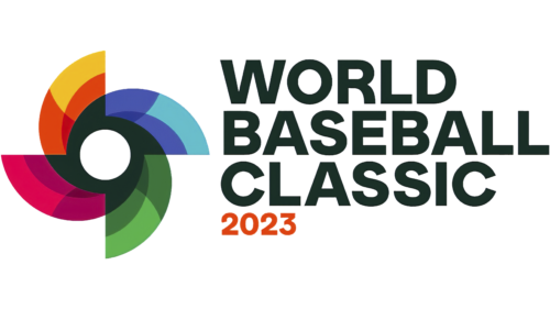
The 2023 return of the American World Baseball Classic will take place under the auspices of the updated identity that was recently presented to the world community. The long period of inactivity of the organization after baseball was excluded from the program of the Summer Olympic Games in 2008 and the World Cup was banned required an increase in the brand’s presence on the sports Olympus. To achieve the desired effect and reflect the current changes, a review of the strategy and organization of the competition was carried out, which was reflected in the graphic identity changes. Created in 2005, the brand provides for the possibility of participation in the finals of 16 teams. The frequency of tournaments – 1 time in 4 years at the initial stage required participants’ invitation. In 2013, the selection was made after the completion of the qualifying round. Qualifying games will precede the launch of the next series of games in 2023 in September 2022. It will be supported by a new identity and a reimagined logo that reflects the direction and features of the brand.
The typography of the new logo retained the style of the font chosen earlier to reflect the name of the Championship. But to enhance attention, it was made bolder, retaining the three-tiered layout and general format of each letter of the text block. All letters are executed in the traditional strict black color. This style symbolizes the brand’s commitment to its history, closely connecting to the past composition. The cardinal change was the transfer of the location of the season date under the text inscription in the left corner and the highlighting of the symbols in red. Emphasis was placed on the title of the Championship, with the highlighting of the date made in smaller characters that do not get lost against the general background of the composition.
The championship symbol also retained its visual features, ensuring brand recognition. However, significant changes were made to its performance, providing freshness, greater brightness, visibility, its modernity. This is facilitated by an expanded color palette, a reduction in the central round negative space, from which elements symbolizing a baseball have been removed.
The updated graphics streamlined the priority of the accents of each visual element, focusing on the dynamics and symbolic display of sports passion and competitive spirit in its pure and honest form. At the same time, it ensured a longer functioning of the emblem in modern conditions, its information content, and the possibility of simple and easy changes.


