Argentina, namely the northern edge of Patagonia – in Río Negro is famous for its exotic dishes. But it is the tea mushroom extract that Slug Club, a brand founded in 2020, brews that is particularly popular around the world. The recipe for its preparation was created by Eugenia Ripari, who worked at the time as a wellness consultant for organic products. Despite many offerings of tea mushroom-based products in Argentina, it was her fermented beverage that became the leader. The brand is available in several Patagonia stores, presented in three flavors – ginger, raspberry hibiscus, and elderflower. With the growing demand for the product, and the desire to go beyond its territorial distribution, the company has carried out a complete rebranding by creating a new identity and packaging.
Tea mushroom, quite well known in Europe and loved in the U.S., in South America still continues to generate genuine interest and excitement. The rebranding provided an opportunity to promote the brand in a market with higher demand and less disruptive effects. This was accomplished with a flexible custom wordmark that has the dual feature of being able to look both accessible and too cool at the same time. This idea is developed and extended by the original color palette and typography. Combined with the eye-catching illustration that was part of the original brand, its identity and recognizability were ensured.
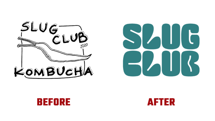
The result was a delicious and intelligent system that is bright and fresh, with a chilling effect that can always be tested at each subsequent meeting. Losing the characteristic homeliness of the previous version, the new logo becomes more modern and easy to perceive. This makes it more attractive and commercially available while maintaining all the benefits of a strong identity.
The image of the logo was drawn in a style that defies categorization. It was essentially a square-curved mix of something similar to classic ink traps. However, it was a simple way of building counters and using negative spaces. They effectively created a contrast to the curved lines. The design is pleasing and fun. It makes professional use of the four short characters in the text block separating the letters L and U. The placement of these characters is kept in the same place, forming a good rhythm. But to strengthen the appeal, both letters have gained mobility and dynamism; they can stretch and shrink both together and in turn, which enhances the effect of attracting attention.


