Modern speeds in the field of development and implementation of digital products have reached incredible speeds in the modern world. This required the developers of software and IT products to take appropriate actions that meet the new conditions. In most cases, it becomes especially important to be able to act not “in step” but already ahead of the curve, which is especially good for the high-tech German brand Nagarro, headquartered in Munich, Germany.
Founded in 1996, the company immediately demonstrated the necessity and usefulness of its proposals. The speed of changes in the modern world has significantly complicated the tasks that constantly appear before a person, making them more and more unique. Their solution requires a completely different way of searching and approach than offered in traditional options. With the help of Nagarro, it becomes possible to get forward-thinking and flexible solutions that a caring partner provides. With their help, it becomes possible to transform, adapt, and create new paths easily.
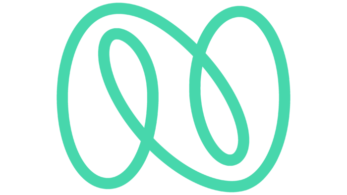
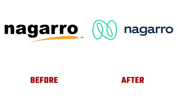
Achieving such global goals also requires an appropriate approach to self-improvement, expanding one’s capabilities, and increasing effective solutions. Being in a constant state of evolution, the platform paid special attention to its own identity. The text element of the logo was made using the font type Hoftype EquipExtended. With the help of modern digital graphics, an original interpretation of the main brand symbol in the form of super-N was created, which refers the viewer to the company’s very name, creating a complex visual image associated with its activities. With its help, the important values of the company, its mantra, and the train of thought of all team members are successfully conveyed. The logo turned out to be especially elastic, easily transforming into the most unexpected images, symbols, and meanings. He exudes strength and confidence.
The sign contains unlimited energy and creates a feeling of agility, dynamics, constancy of movement, and the possession of incredible flexibility. The symbol demonstrates the ongoing efforts to develop, improve and strengthen the brand’s relationship with all its partners. It is also an effective way to make your thinking and attitude towards everything around you accessible and understandable to everyone. The original monogram of the letter N has not only advantages in terms of the effectiveness of its perception. It provides the formation of the necessary links and ease of integration into various digital and typographic systems.


