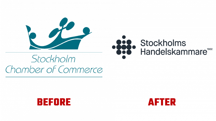
The leading business organization – The Stockholm Chamber of Commerce from the Stockholm and Uppsala regions, founded at the beginning of the last century, decided to change its identity. An important task was entrusted to Brand Union Stockholm, a Swedish agency that implemented it creatively and unexpectedly. The main direction of the brand’s activity is the development and implementation of policies, influencing the persons on whom decision-making on business issues depends.
By deciding to update its look, the brand has acquired an identity of great sparkling, aided by the applied circular pattern, which has a vibrant color palette that is completely inappropriate for the Chamber of Commerce. But it is precisely this approach that makes the new visualization unique and playful. The basis of the new brand is the understanding of the problems that constantly appear in the company’s development. At the same time, the interpretation of the living pulse of the city itself was effectively visualized. The created concept – a “living city” distinguishes the Chamber of Commerce and Industry as an energetically powerful and constantly developing center. The keywords defining its essence are used in the identity system – movement, life, activity, innovation, development.
The style that Brand Union Stockholm developed especially influenced her perception. The restart was so powerful that it even surprised the employees themselves and made them feel proud. The exterior design has become brighter and more noticeable. The implementation of the updates affected all areas at once, at all points of contact – in social networks and on our channels, in live broadcasts and on image products, in the dress code, and the physical presence of employees in the office.
The logo itself has undergone a dramatic change, including the icon in the letter “H” – a monogram, a slash, and an abstract element. The icon and the row of dots convey the idea of unification that the brand promotes so well that it does not require additional explanation. This option is a subtle metaphor that conveys the required information beautifully and easily. The typeface used is Maison Neue by Milieu Grotesque, which has some ease of perception. The whole composition stands out for its lightness and practicality while being easy to read and memorable. Its visual language is distinguished by grace and a pleasant combination of yellow and dark gray shades of a new color palette.


