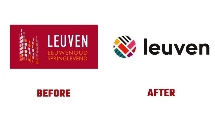
Ten years after its latest rebrand, the Belgian city of Leuven has turned its attention back to its own identity. In modern conditions, ten years is a huge time during which cardinal changes occur both in the surrounding world and directly with the cities themselves. In an effort to keep up with the times, such events must necessarily be reflected in the visual identity, especially if the city is over 1100 years old and is world-famous as a university center, which houses the oldest university in Europe founded by Jean IV of Brabant. Today it is the main city of the province of Flemish Brabant, which holds many historical and cultural treasures, being the centers of historically important architecture, which was almost destroyed during the two World Wars. But over the past ten years, the city has significantly changed and continued its growth and development as a cultural, historical, and educational center, being of great importance for the whole world. The need to reflect all current changes and ensure that the visual reflection of the city’s essence matches modern trends was the reason for the current rebranding.
The completely redesigned and rethought new style of the house accurately and fully conveyed what the city of Leuven is today. It is a warm and cozy city with a population of more than 190 nationalities living and working together in peace and harmony. The created image of a single colored canvas, consisting of various elements patches, presented in various shapes and colors, symbolizes this cohesion and integrity of so different in one common. The new identity visualizes the openness and looseness that characterize the city, its revolutionary innovativeness, where endless possibilities and limitless avenues open up. An important point of the new visualization was the reflection of its constant youth and freshness, dynamism provided by its young residents – students. Leuven is a city of constant movement and renewal, which always thinks about the future, respecting its past.
The new logo symbolically reflects the map of the city in its bright splendor of various colors. At the same time, the geometric shapes of the logo are a reflection of the correct location of urban areas. The execution of the logo resembles the structure of the stained-glass windows of ancient cathedrals, which strongly link the modern city with its rich past. At the same time, the logo is perceived as an ode to its characteristic diversity and creativity. The composition has an open form, demonstrating readiness for cooperation and any changes. One feature of the logo draws attention – some of the elements have shading in black and white. In this way, designers communicate about the incompleteness of the story. And the red tones are in common with the main coat of arms colors. They occupy the center of the composition, forming the appearance of the letter L – the first letter of the city’s name.


