A Unique Education – The Technopolis Museum, located in Mechelen, Antwerp, provides the opportunity to discover many interesting and fun things about science and technology. To stimulate the use of technology and popularize science among Flanders residents, especially children, the museum is constantly updating the themes of the ongoing interactive exhibitions. To attract more attention, especially today’s youth, the brand turned to the independent creative studio Mutant (Antwerp, Belgium), which stands out among similar structures by creating culturally significant brands, applying innovations, and solving interdisciplinary problems. Possessing not only a high level of professionalism and a creative approach, but the studio also prioritizes a specific strategy, the most appropriate thinking, combining everything with the experience of artists, designers, artists, psychologists. All content is collected and marketed using digital technology, tools, and physical products.
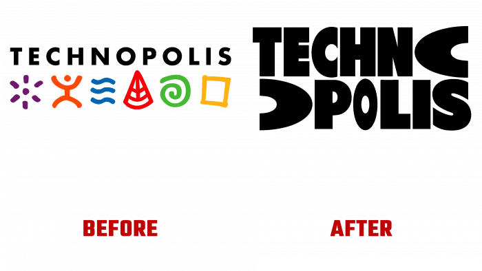
One of the rules that Mutant uses in his work is to form the beginning with his mindset for success, that everything should be only super. In working with the museum’s identity, the beginning was built on the need to solve the problem associated with the need to constantly surprise and attract children, opening up a new world of interests and hobbies for them. The so-called WOW factor underlies the unique style and exterior design. The text element, which forms the basis of the logo, is made in the original graphic design. First of all, an attractive move was used to divide the letter “O” into two parts. Thanks to this solution, the word that denotes the name was divided into two parts, which ensured the visual perception of the composition as a sign of two components, creating a modern sign that is easily scalable and distinguishable in digital platforms. At the same time, the emblem opens up wide opportunities for further development, demonstrating the new achievements of the brand in its development.
The logo has become a spectacular demonstration of creating an adaptive system, which in its visual performance reflects the continuous development of science and technology. Dynamic typography, vibrant color palette, chosen based on a simple but universal system, provided a strong contrast between external influence and internal symbolism. Dynamic solutions, eye-catching animation, and the occasional surprise appearance of the typographic mascot Wowza guarantee the constant attention of children to the brand’s offerings, which speaks of his constant concern for the younger representative of humanity.


