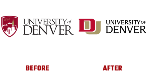
The University of Denver underwent a visual identity upgrade as part of a brand renewal program. It only touched on some elements: the main focus was on the academic emblem. The final result will be published in November 2022.
The goal of a higher education institution is to keep up with the times, so in September of this year, it announced the start of a multi-year and multi-stage evolution of the brand. Its result should be the unification of the university program and two campuses. Preliminary preparation for this step was long: it was preceded by two years of research and market sounding.
As noted in the press release, the need for a common DU logo was identified among the students. This would allow each facility to increase prestige, find key audiences, and succeed within unity. Therefore, the University of Denver now has an emblem, improved font, modernized elements, and an expanded palette.
In the new version, the block letters are intertwined: the left part of the “U” is visible in the gap of the “D,” although they were previously superimposed on each other. For a better view, the glyph in the background is colored gold, and in the front, it is dark red. So they do not merge and maintain clear boundaries. The designers also got rid of the cut corners and smoothly rounded them.
The inscription next to the sign has also changed. She received more grace due to thin letters with a slight thickening, which replaced the classic serifs. Pointed ends make them clear and distinct. The background is a hatched silver ring.


