


Amazon’s Prime Video streaming service, which offers paid access to its programming, launched a new logo for its Thursday Night Football (TNF) brand. A commercial for the revamped brand will be unveiled during the broadcast of Super Bowl 55. NFL games are especially popular with soccer fans, making TNF’s broadcast a key way to elevate the revamped brand. Granting Prime Video exclusive broadcast rights gives viewers a unique experience.

The new brand visualization results from close and effective cooperation with Pentagram Design Studio. The marketing campaign began with logo development. The designers drew inspiration for its creation from popular elements of sports paraphernalia and original images – the tip of an arrow, which can be guessed from an Amazon smile, and the pointed shape of an American football. The identifying elements will accompany the brand during next season’s showcase. The updated visuals convey the brand’s unity and shared identity, reflecting the excitement only the NFL brings to fans. The new logo takes the form of a heraldic shield, with recognizable brand and Prime Video emblems in the upper sections. The shield’s main field is filled with a text block of the channel’s full name. Following the minimalist style, the image includes no other elements that distract from the main information. This design ensures recognizability and makes the information easy to process.
The main text is set in a sans serif font with a characteristic left-hand slant, describing the desire to win, the further development, and the dynamics of the sporting events. Bold letters, stacked one above the other with a center indentation, are white, providing contrast against the blue gradient background. The text is easily readable in all logo sizes.
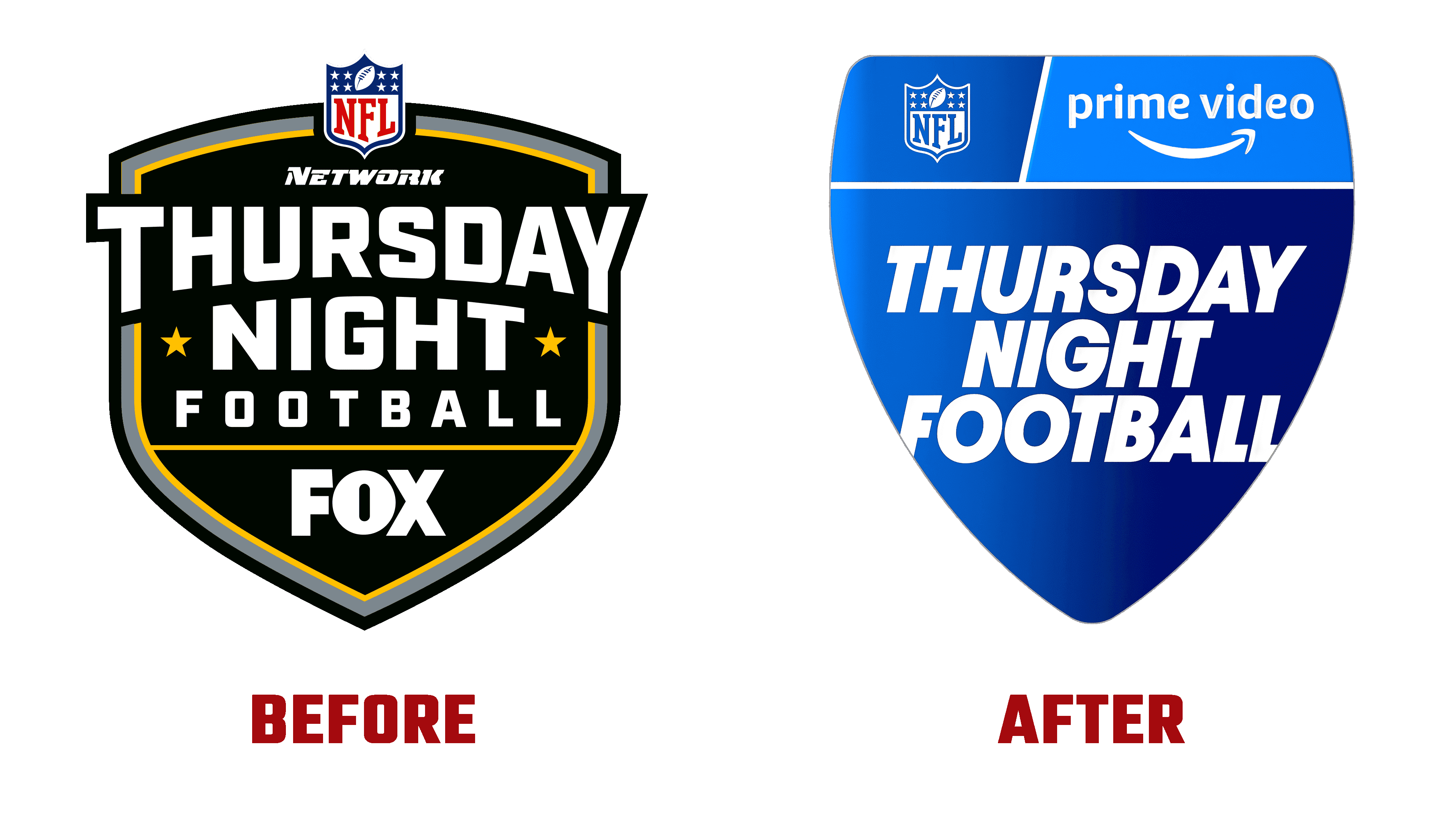
The brand’s signature color is blue in its various shades. Reducing the color palette respects the logo’s minimalist style, ensuring the visual sign is easy and simple to perceive. Changing its shape allowed us to present the sports television brand’s features and changes differently.