If we talk about a successful and well-known company that simplifies and automates the processes of creating, distributing, and signing contracts from A to Z, then this is all OneFlow. It was founded in 2012; its headquarters is located in Stockholm; 100 employees are working to improve the document management system. Over the entire period, 3.5 million contracts have been produced and signed. Impressive figures, although nothing is surprising in this: technically easily realizable projects, a conventional data processing system, without unnecessary operations and maneuvers in Photoshop or Pdf-converters. Therefore, the brand has become an influential platform and a highly respected brand.
London-based company Multi-Adapter was responsible for the design update. The main message: we know that the world is changing, but the digital space still looks towards the good old system of legalization and intellectual rights; contracts to this day carry weight, well, we will emphasize the conservatism and modernity of our brand, which remains “in the subject.”
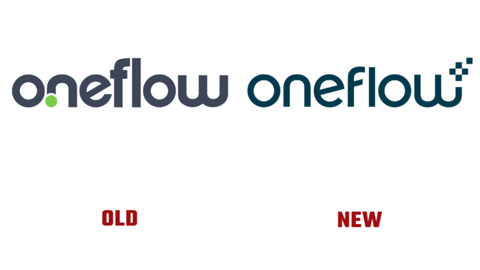
Flexibility, fluidity, and flow were emphasized in the logo. Interestingly, the logo was just a graphic reflection of the name; earlier, it had more roundness and a green dot at the base of the letter “n.” All letters are equal, no uppercase, and the base color is charcoal gray. It is impossible to say unequivocally what the company is doing, but the contrasting green circle-dot seems to indicate some zest, completeness or focusing on details.
In the new logo, the font is not so bold, and the beveled stripe in the “e” has its continuation in the stripe of the letter “f,” which speaks of uniformity, flow, continuation. Now the catchy emphasis has shifted to the “W.” Five small squares, of which one stands out as if flying away from the others, add aesthetics and severity at the same time because there is no full-fledged pattern.
It turned out that this idea is based on a symbol of magic – the service customers do not at first expect such a “wow” effect from using it. It turns out that a surprise awaits them and a high-quality product for work.
A fairly harmonious logo, which still does not make it clear what the company offers, but at the same time does not leave indifferent those who are interested in a visual image. This is the appeal of the new visual solution.
Extraset Rebond Grotesque uses the font, so the impression is light and good-natured.


