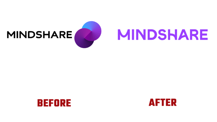
In 1997, the global media network Mindshare was created, resulting from a merger between JWT and Ogilvy & Mather. Striving for the realization of its main mission – to provide effective assistance for implementing ideas ineffective business partnerships through a high level of culture, original thinking, and increased speed of implementing solutions to problems built on teamwork. Today, a brand is a collaboration with many partners around the world. London-based design studio NB was invited to create a new visual identity display and presented a redesigned brand visual identity.
The new visualization was built on an important feature of the brand’s activity – serving by it at the moment a huge client base of transnational corporations. The company’s main task is to transfer its own business to a new digital space effectively. At the same time, a direct focus on the consumer was ensured. To vividly and attractively reflect the partnership approach that is the basis of the brand’s policy towards media services, an exciting visualization has been created that has extraordinary flexibility and dynamism. This approach makes the wordmark visually active, fully disclosing the brand name and its literal distribution.
Successful cooperation with some of the largest world-class companies has provided the company’s required image, representing it as an agency that uses only verified data and the achievements of modern technologies in its work. The current global update has become a response to ongoing changes – a change in leadership, updating and expanding the range of services offered, revising the form and presentation of information. This is supported by the updated color palette, in which the main corporate color is purple – a color with a wide range of visual impact. Depending on the features of its application, the use of additional shades, you can create the required softness or overwhelming effect, which, if properly distributed, will form the necessary atmosphere for presenting the information.
The development of the new logo was carried out in accordance with modern trends. The font used is sans-serif, with some rounding of its elements and creating comfortable and attractive curves. They create a memorable composition, standing out from the general background of the composition. However, in general perception, the font has some imbalance, which manifests itself in the execution of the letters N and HA, which is muted when the logo is activated. The result is a dynamic, adaptive, and resilient digital identity that maximizes information, memorability, and readability.


