Turkish intellectual property and USE-CASE MOBILITY brand Togg is preparing to start producing a new electric vehicle in 2022. It was established in 2018 as a joint venture and has manufacturing facilities in Gemlik. The new project will be the first next-generation SUV, the result of the company’s developments in this area and the surrounding mobility ecosystem, where its new technologies have been applied with the possibility of providing additional services of a wide range. The plan is to create five connected models that have the same platform to achieve 1 million electric vehicles by 2030.
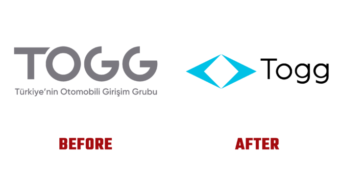
The new identity was aimed at causing an antisocial outburst in the viewer, demonstrating the brand’s new policy and strategy. The basis of everything was people and their needs, which are now a stimulating element for developing and promoting innovations. It reflects the main mission of the company – the creation of a unique product, which will be based on user experience, accelerating the transition of both consumers and related infrastructure to electricity consumption. Given the direction of the company’s activity – transport and technology, its visualization has become a reflection of both of these areas.
An important moment was the creation of an identifier – a symbol that reflected the importance of the intersection of two directions – mobility and communication, which are especially important for users. They were two converging arrows as a symbol of the unification of East and West. The open quadrilateral and diamond shape formed by them in the center demonstrates strength and elegance. The shade of the sea wave chosen as the corporate color refers the viewer to the waters washing the country’s shores.
The geometric simplicity of the symbol is complemented by its broad appeal. In this way, effective identification of an enterprise with a wide range of offers and services is created. First of all, the new design is fully consistent with the brand’s perception as an innovator in the automotive industry, distinguishing it from competitors. A text block in a round font provides an advantageous contrast with an angular character, complementing it and bringing friendliness and goodwill to the visualization atmosphere. This is especially facilitated by the capital letter of the name, which contributes to its perception as a name and not as a separate element or abbreviated abbreviation.


