Dairy Brand Replaces Packaging And Shows A New Image.
Tom Parker Creamery is popular with UK residents. The company was named after Tom Parker, who was engaged in agriculture and delivered milk on a cart. The fame of the quality of milk spread among the people of Hampshire. According to the manufacturer, milk from free-range cows is used for the production of dairy products. The brand’s resourcefulness is reflected in the packaging – glass bottles that are easily recyclable or reused. Using only natural products, the Tom Parker Creamery brand is committed to sustainable trends.
The White Bear company developed a new identity from London. The team shared their experience working with Tom Parker Creamery and said that the brand did not have a clear architecture that could be used for further development at first. White Bear “dug deeper” got acquainted with the history and heritage of the company to do quality work.
Tom Parker Creamery’s identity is based on major differences from the competition. Among them are the free range of cows and high-quality feed. The brand cares so much about the quality of the product that it plays music for animals during milking and scratches the backs of cows. Thus, the White Bear team came up with a beautiful proposal, “Happy Cows. Happy Milk “.
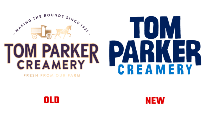
The company logo consists of the name of the company in a script-like font. The animated picture is complemented by a drop that falls on the letter “A” in the word “Parker.” The color palette is composed of 2 shades of blue.
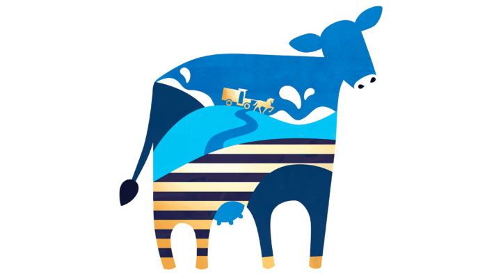
The packaging design is in harmony with the idea of the brand. Previous bottle images were sophisticated and gave the impression that the consumer was buying a high-end product. Now Tom Parker Creamery uses a cow silhouette with different images inside. Pictures represent the taste of the product and differ in color and some details. The brand is completely satisfied with the rebranding and expresses its gratitude to White Bear for hearing all the wishes and bringing them to life in the best way.


