


![]() Tommy Hilfiger Logo PNG
Tommy Hilfiger Logo PNG
The logo of the designer footwear and clothing brand Tommy Hilfiger is presented as an international maritime flag, symbolizing the letter H. The graphics feature an attractive emblem that emphasizes the company’s core values and reflects its historical heritage.
Tommy Hilfiger began in 1969 when the designer opened People’s Place in Elmira, selling flared jeans brought from New York. The store gained local popularity but closed in 1977, leading him to continue work in New York with other brands.
In 1985, with Mohan Murjani’s backing, he launched his own label. A Times Square billboard placed his name alongside Ralph Lauren, Perry Ellis, and Calvin Klein, triggering backlash that quickly turned into publicity.
The brand built its identity on American preppy style, using red, white, and blue and drawing on New England imagery. It positioned itself close to Ralph Lauren but targeted a younger audience.
Growth accelerated in the early 1990s through hip-hop culture. In 1994, Snoop Dogg wore a Tommy Hilfiger sweater on Saturday Night Live, leading to immediate sellouts and wider recognition.
The company went public in 1992, and by the mid-1990s, revenue exceeded $ 800 million. In 1995, Hilfiger received the CFDA award, and partnerships with artists such as Britney Spears strengthened its cultural reach.
By the late 1990s, overexpansion and discount distribution weakened the brand. In 2006, Apax Partners acquired control of the company for $1.6 billion and shifted its focus to Europe.
In 2010, Phillips-Van Heusen acquired Tommy Hilfiger for $ 3 billion, adding it alongside Calvin Klein.
In 2016, the Tommy x Gigi collaboration with Gigi Hadid renewed the brand’s visibility and reconnected it with younger audiences.
Meaning and History
![]()
The Tommy Hilfiger logo has not changed since 1985. All because it was initially the face of the brand: visual identity, which determines marketing success, was built on the logo. Art director and designer George Lois developed the recognizable trademark. Since then, the red-white-blue pattern has become the central decoration on t-shirts, jackets, and trousers. This is how a new fashion trend emerged, where the main focus was not on Tommy Hilfiger clothing but on its logo.
But such a strategy proved a failure. In 1999, the manufacturer’s stocks fell nearly in half, sales slowed, and flagship stores in Beverly Hills and London closed. The brand owner believed that the public was not ready for adventures and no longer wanted to see the famous logo. He reduced its size and even started thinking about replacing the tricolor quadrilaterals with something elegant, like Prada or Gucci. However, the reform idea remained unrealized.
What is Tommy Hilfiger?
It is the name of the designer who founded Tommy Hilfiger BV in 1985. It’s a premium brand of footwear, clothing, accessories, perfumes, and home goods sold in a network of 2,000 retail stores. Since 2014, the company has been owned by the American corporation PVH Corp, but its headquarters have remained in Amsterdam, the Netherlands.
Font and Colors
It’s hard to believe, but the letter “H” is encoded in the logo’s graphic element. It is symbolized by two white and red rectangles stacked horizontally. Also, these two rectangles coincide with the flag named “Hotel” from the International Code of Signals. Sailors use it to communicate the presence of a pilot on board. Of course, Tommy Hilfiger did not put such a meaning into his badge. He chose it only because of the association with the letter “H.”
The emblem conveys the company’s core values, rooted in a 100% commitment to the American style. Therefore, it contains two dark blue stripes taken from the first flag of the USA, called “Serapis.” They convey the historical heritage and link the fashion brand to the cultural past of its homeland.
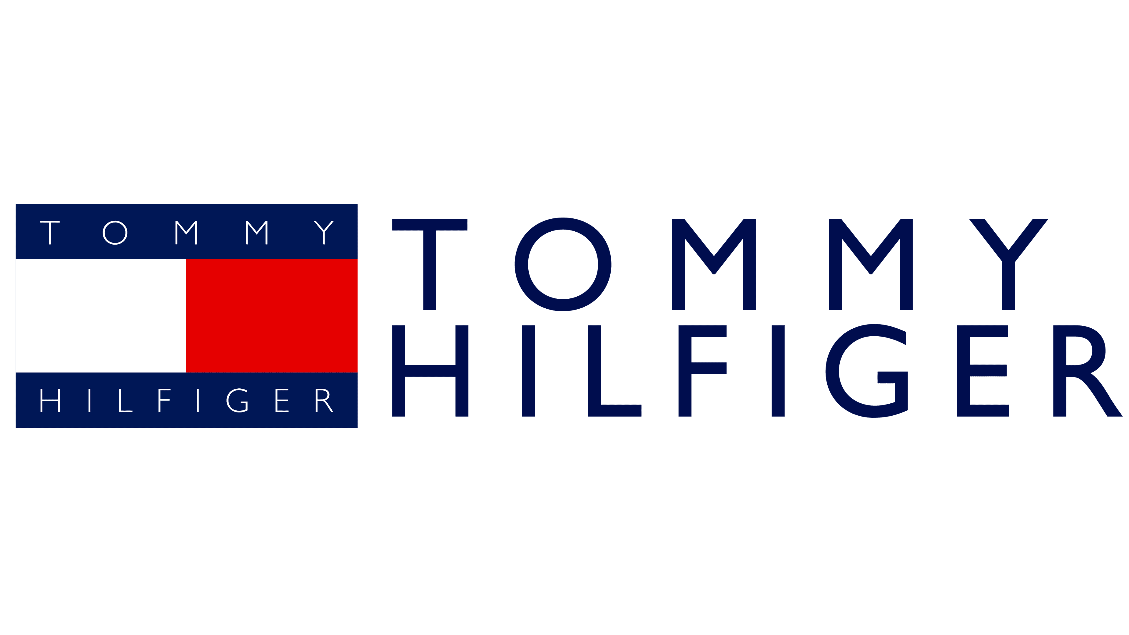
The brand name complements the phrase “Tommy Hilfiger,” executed in uppercase sans-serif letters. Designers used the Gill Sans font for the inscription. Most often, the picture is placed between the two words. But sometimes, the company’s name is placed directly inside the horizontal blue stripes. In this case, the spacing between the letters may change.
FAQ
What does the Tommy Hilfiger logo mean?
The Tommy Hilfiger logo denotes the letter H. The fact is that two rectangles in white and red were taken from the international maritime flag H in the Code of Signals. Initially, this symbol meant, “I have a pilot on board.” However, the clothing and footwear manufacturer uses it solely as a substitute for H, with no additional connotations. The two dark blue stripes symbolize the first flag of the USA, Serapis.
Why did Tommy Hilfiger change its logo?
The Tommy Hilfiger company has never changed its logo. It uses two emblems simultaneously; the old version is encountered less frequently, and the new one more often. The first version contains the famous symbol of four different colored rectangles, and the brand name is written inside the blue blocks. In the modern logo, the inscription is placed outside the geometric figures.