


Today, baseball is particularly popular in 120 countries worldwide, continuing to expand its fan base. This has led to the sport becoming an entire industry that competes very effectively with soccer worldwide. It is no longer just sports teams, players, and leagues. The world includes extensive production of specialized sports equipment and supporting media infrastructure, necessary associations, movie productions, and many other aspects that turn sports into an industry. Therefore, the ability to stand out in this highly competitive environment with unique, distinctive signs, emblems, and logos takes on a special significance.
Baseball symbols effectively emphasize individual differences and team features, making them easily recognizable and transforming logos into well-known brands and national symbols. What sets them apart is their creative approach to design and the use of details that immediately evoke baseball. Images of bats, white balls with red seams, helmets, special gloves, and player silhouettes are important elements of baseball symbols. Along with them, word forms and letter symbols based on team names are widely used, allowing you to create unusual and attractive graphic compositions with them. Of course, here, they find their place in elements of national and regional symbols. To enhance the attractiveness of emblems, their owners, as a rule, use a bright, diverse color palette that cannot go unnoticed.
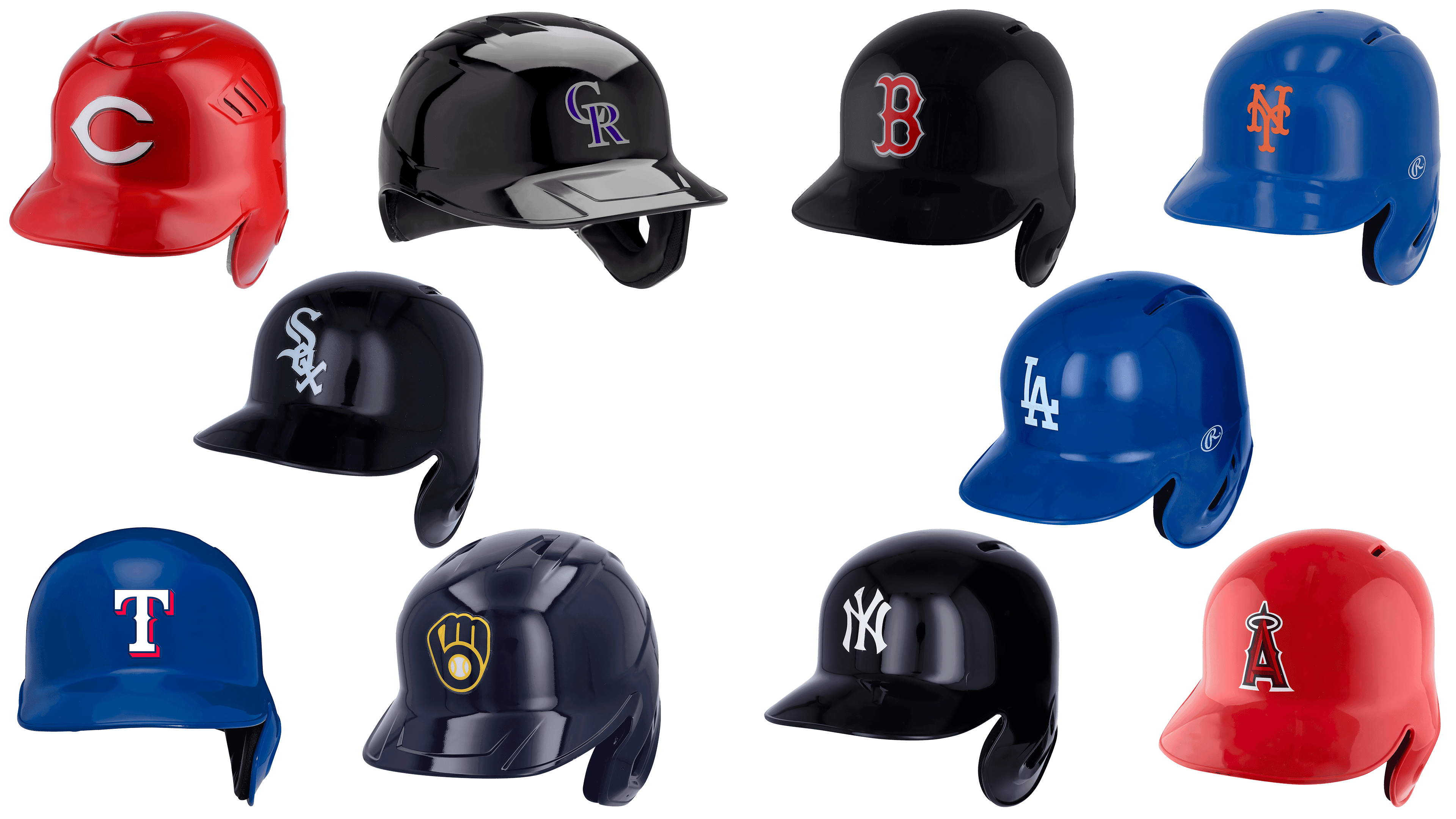
10 Chicago White Sox

Among the most famous MLB emblems is that of the Chicago White Sox, a club from Chicago, Illinois, founded in 1900. It is very popular, which is why it appears on baseball caps worn by fans in almost any country. It represents a graphic composition of three letters arranged on the vertical diagonal Sox, made in the Gothic style. For its qualitative and attractive display, a bold white font with pointed ends is used, contrasted against the black background of the players’ baseball helmets. Each successive letter overlaps the bottom of the previous one, forming a lettering that descends from the upper-left corner. Contrasting, austere, and unique in its simplicity, the color palette gives players’ helmets a modern, stylish look, setting the club apart from its peers.
9 Cincinnati Reds
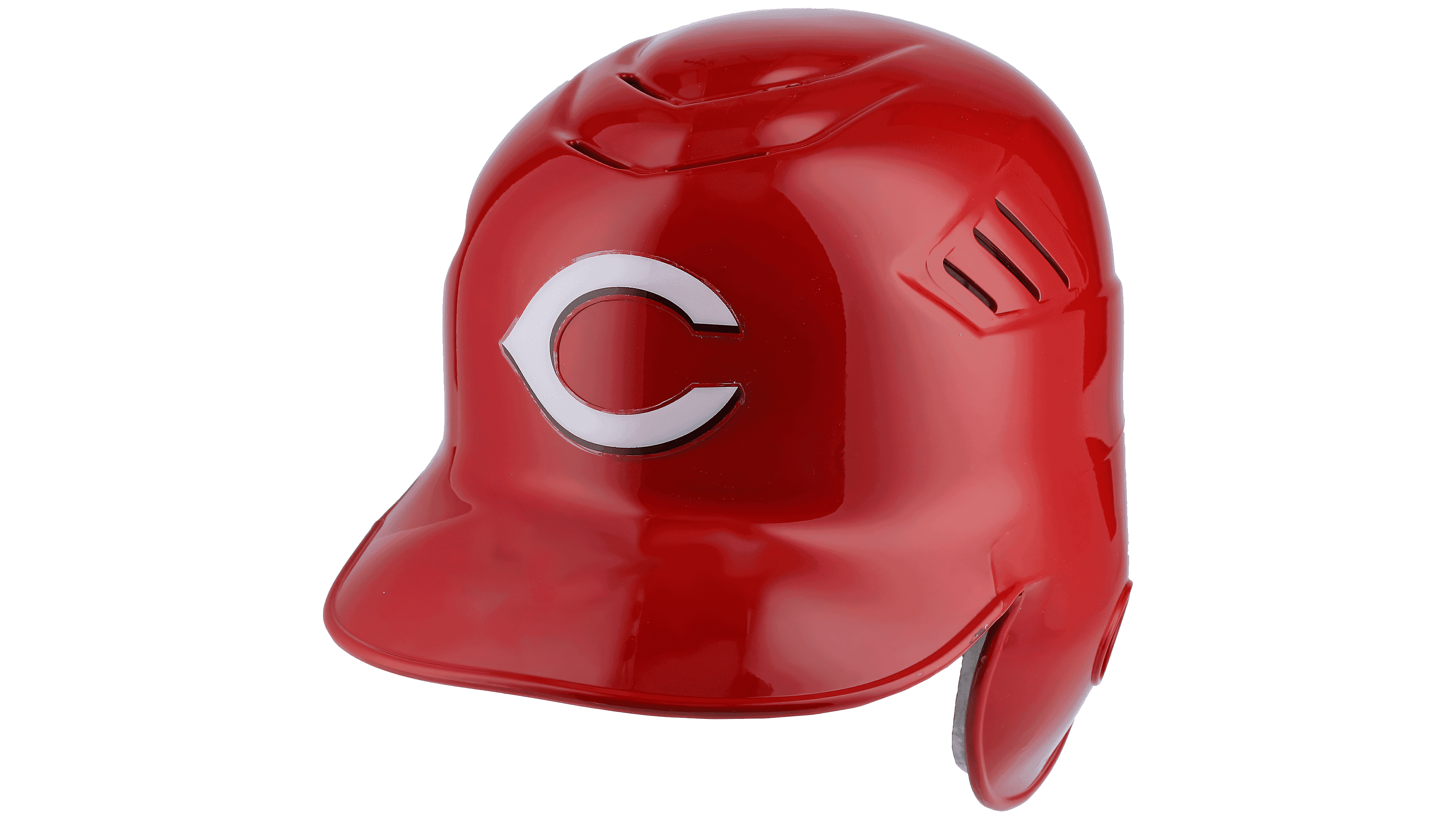
The professional baseball team from Cincinnati, Ohio, was founded in 1866. In 1882, the club became an entirely new roster featuring players who had not previously played for similar clubs. The brand is known for its original emblem. Moreover, the graphic composition created on the baseball cap looks more interesting than reflected on the jerseys. The helmets have a solid, rich red color, which serves as the perfect background for the simple yet elegant inscription on the emblem. This white letter “C” is shaped like a wishbone, with the outline extending horizontally at the center. Using a contrasting red-and-white palette and a laconic execution draws the eye to such a modest composition. It forces the viewer to look more closely at the image, noting all the details and features of the letter’s contours.
8 Los Angeles Angels
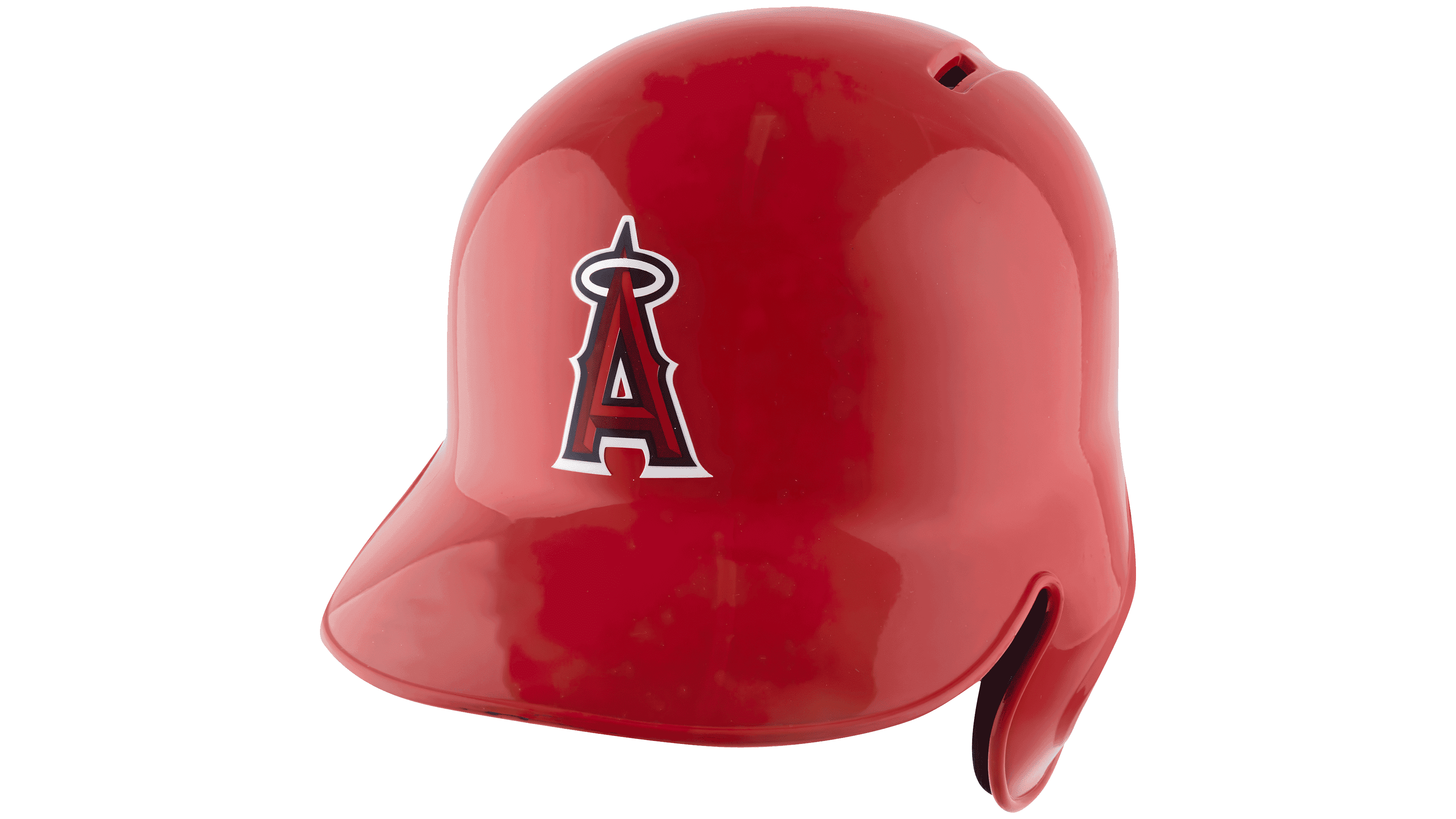
In 1961, the Los Angeles Angels professional baseball team was born in Anaheim, California. Today, this club plays in MLB and uses an original, cartoonish emblem. Thanks to this execution, it unexpectedly evokes childlike, joyful feelings in the audience. At the same time, its color scheme, in the traditional red-blue-white palette, with a small yellow halo, greatly enhances the emotional effect. A tiny yellow ring atop the thick capital letter “A,” set in a dark red modern geometric sans-serif font, enhances the overall appeal of the composition. The outline of the letter is highlighted with a white stroke to enhance the contrast. The resulting simple logo is a great example of how super minimalism can turn the traditional into an iconic emblem.
7 Texas Rangers
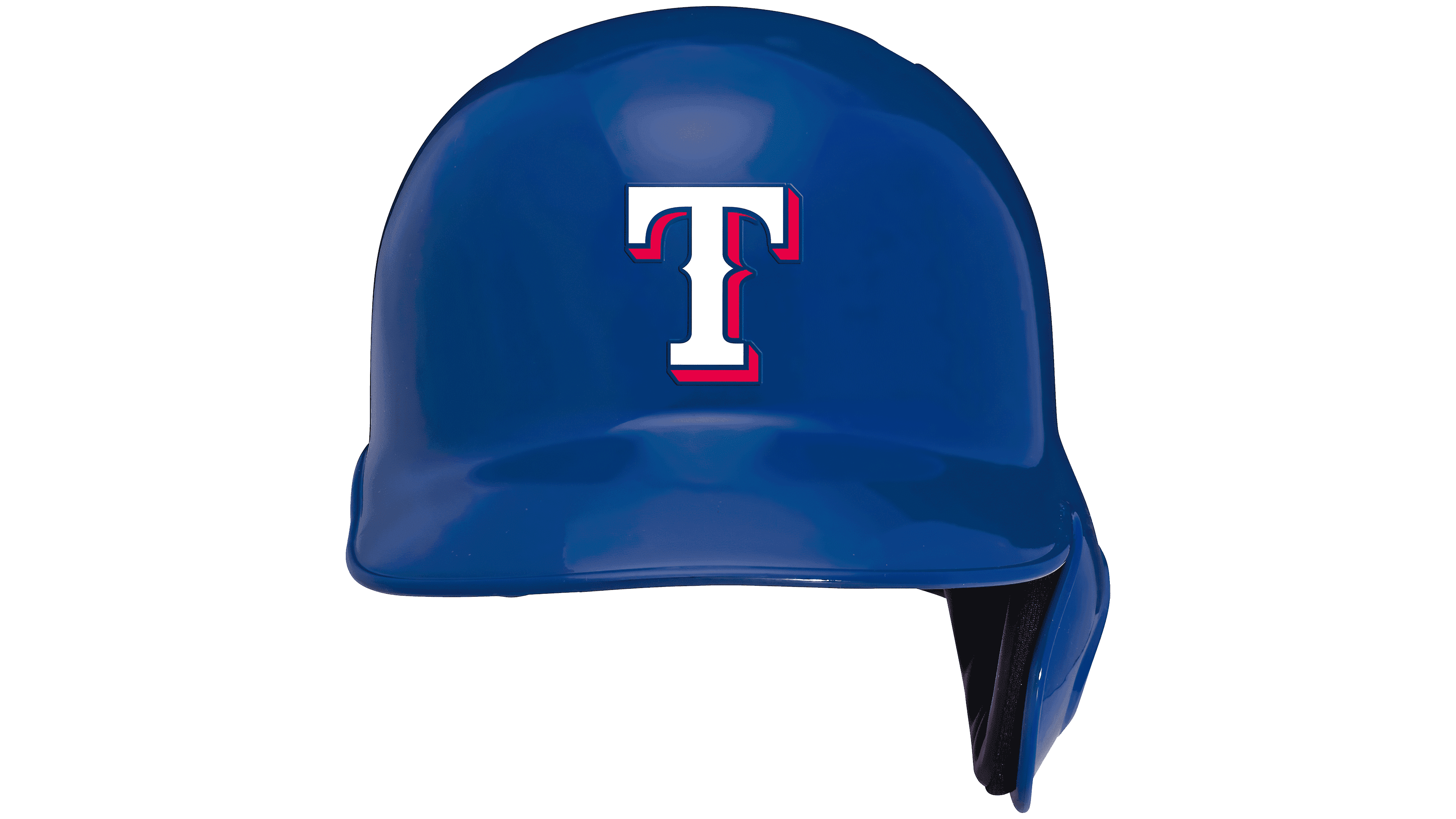
The owner of a simple and concise logo in the form of a white “T,” the Texas Rangers baseball team was founded in 1961. It was originally called the Washington Senators, but after MLB expansion and the previous team moved to Minnesota, it was renamed the timeless name we know today. The club’s emblem’s uniqueness and appeal were achieved using the original color palette. The team’s traditional color is blue-red-white, a combination of shades of blue that is bright, deep, and vibrant, making it the primary corporate color. At the same time, a dense, attractive font is used for lettering, whose smooth lines merge somewhat with the background due to a dense red background shadow. The logo benefits from the color scheme’s brightness, richness, saturation, and increased contrast.
6 New York Mets
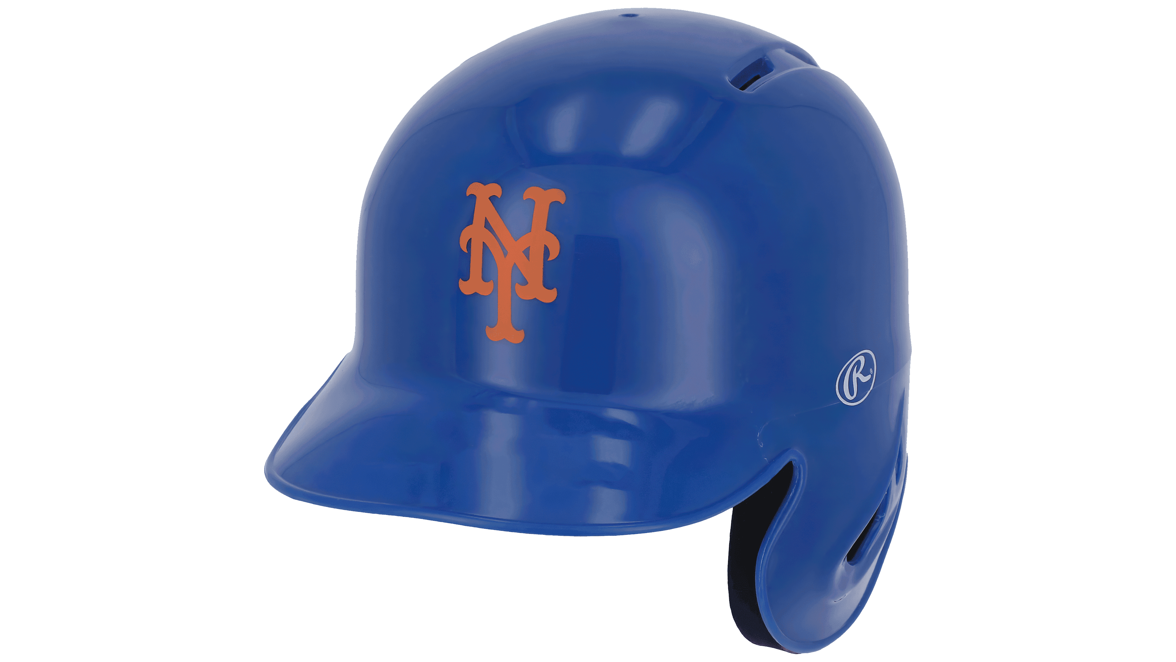
The New York Mets baseball team from New York City has two logo variations on their sports equipment. Founded in 1962, the club has undergone several changes in its visual appearance. Today, it is known for its iconic orange monogram on the front of its sports helmet and its bright blue color scheme. Curved, arc-shaped stripe lines, rounded corners, and an enlarged font with additional strokes characterize the monogram. The Mets inscription is located on the side of the helmet. Its letters are rich blue and distinguished by boldness, absence of serifs, and use of double white-orange lettering. The composition essentially repeats the traditional tricolor, with the classic red replaced by orange. Such graphic design significantly changes the usual images, making them uniquely attractive.
5 Colorado Rockies
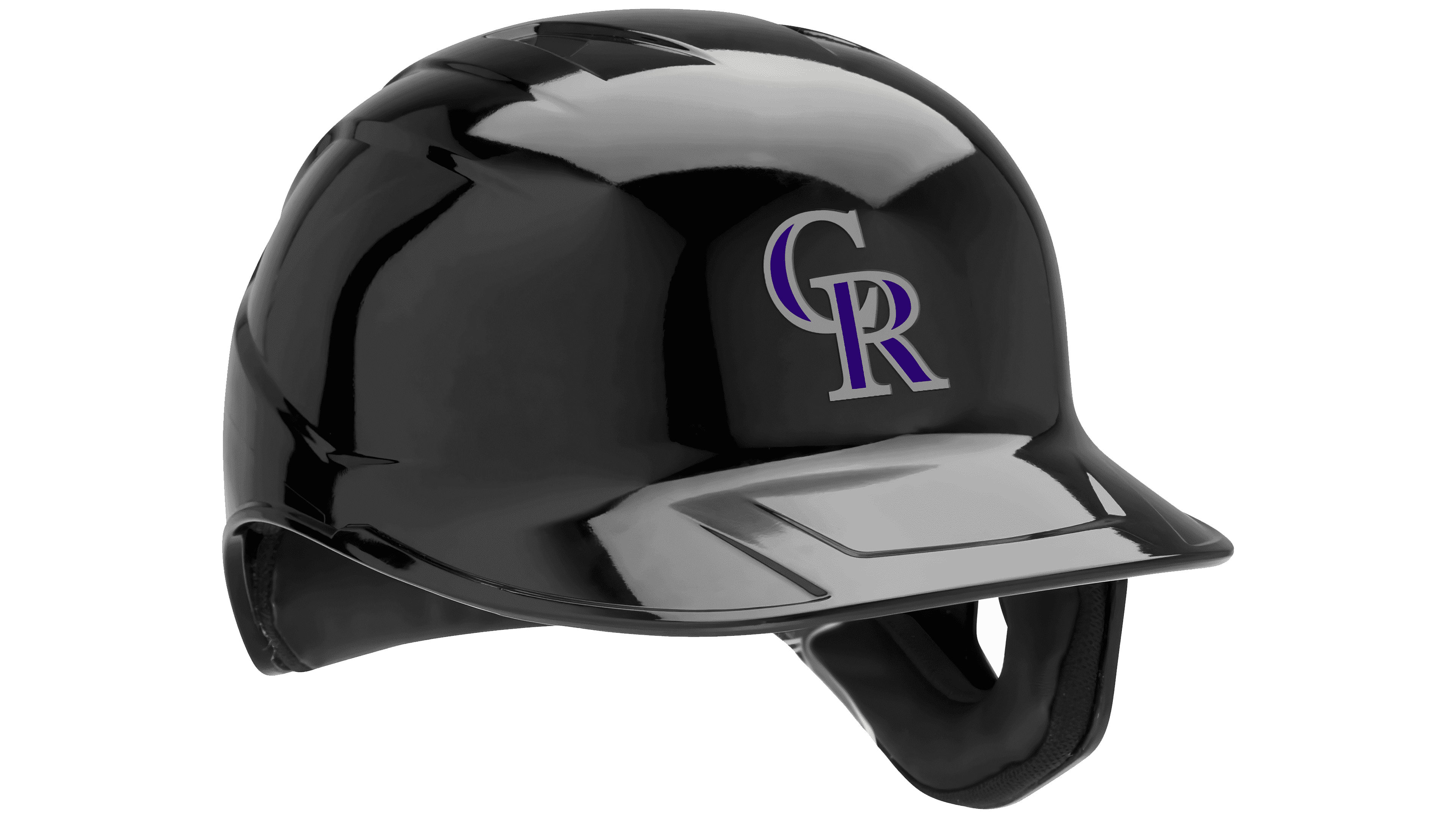
In 1993, the Colorado Rockies, a professional baseball team that plays in the MLB today, was registered in Denver, Colorado. A distinctive feature of the club is its brutal yet powerful logo, characterized by ruggedness, strength, and confidence. For this purpose, capital letters “S” and “R” are used, set in a traditional, elegant serif font. The composition is made so that the upper part of the letter “R” overlaps the lower element of the first letter. In contrast, the letters are outlined in white and executed in a rich corporate blue. Their arrangement on a matte black background evokes determination and danger, underscoring the character of super-strong opponents for any team. The outline of the letters can transition to silver, providing greater brightness and somewhat softening the emblem’s psychological impact.
4 Boston Red Sox
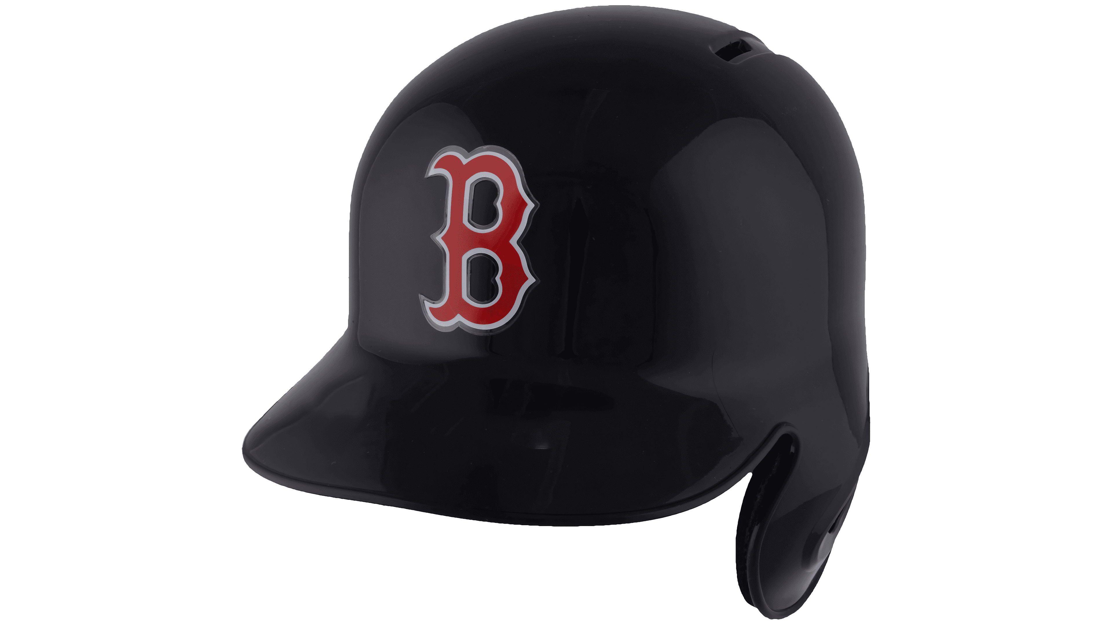
MLB features the Boston Red Sox, a professional baseball team from Boston, Massachusetts, founded in 1901. Its official visual style is one of the most recognizable. The club’s emblem has become a trendsetter in street fashion, with brands worldwide creating designs inspired by it. The reason for such popularity was the harmonious proportions of the composition and the color palette, which were used to form the emblem’s only element, the well-known letter “B.” The letter uses a rich, bright red shade, elongated lines, arc-shaped elements, and pointed ends. Its bold white outline creates the best visual appeal against a plain black background. This created the perfect contrast and conveyed the club’s professionalism and excellence.
3 Milwaukee Brewers
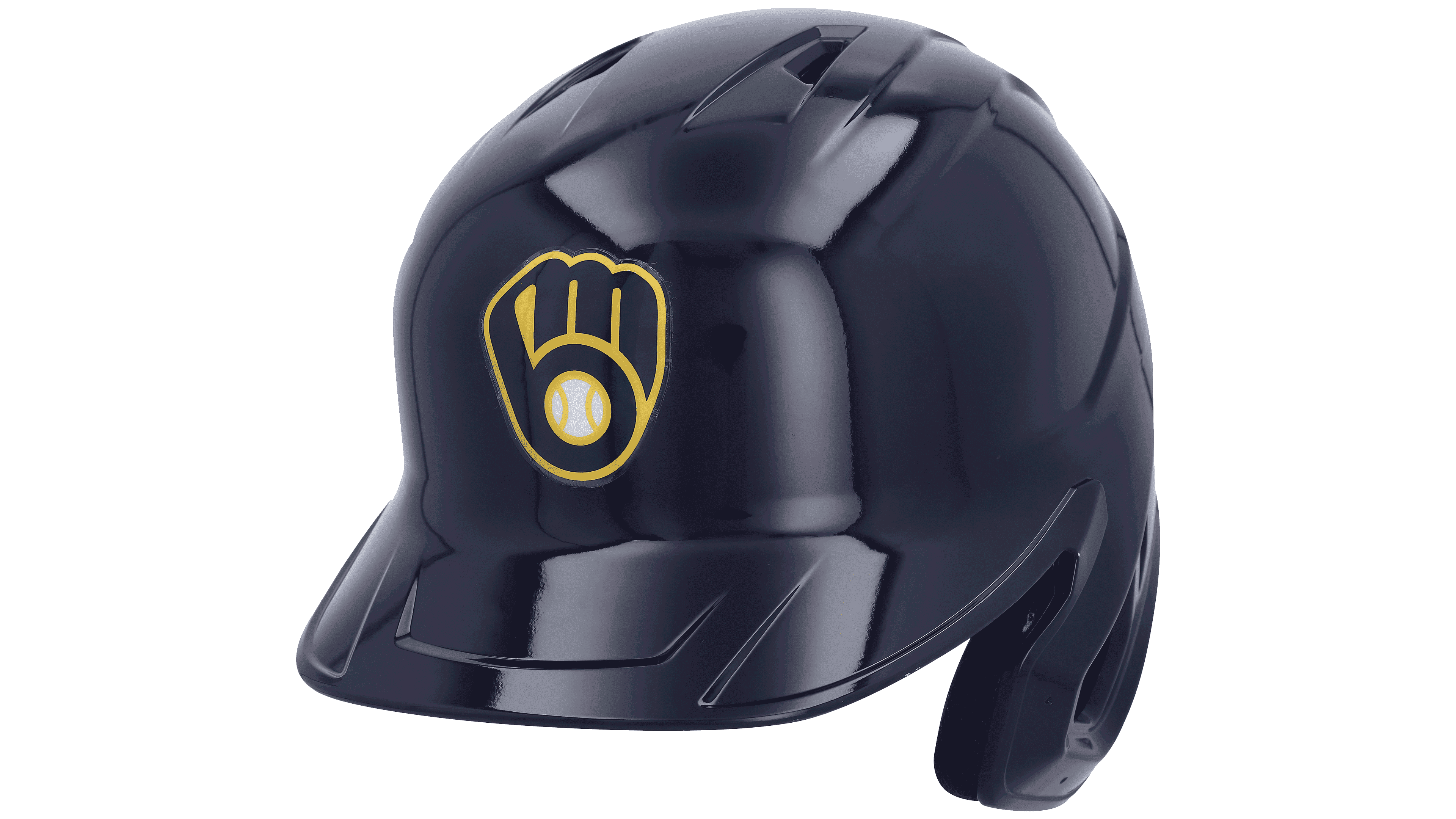
Founded in 1969, the Milwaukee Brewers baseball club from Milwaukee, Wisconsin, stands out among MLB team emblems. It is a monogram of the first two letters of the name, in lowercase and stylized as a baseball glove. The negative space of the graphic composition creates a visual perception of the letter itself. It is filled with a white-yellow image of a ball in the lower element of the letter “B.” The monogram is made in a dark blue shade and applied to the team’s helmets. A yellow outline around each element effectively emphasizes it. The sign turned out memorable and unique in its modern execution. It looks unconventional on any sportsman’s equipment. The capital letter “M” is often outlined in a soft golden hue.
2 New York Yankees

The New York Yankees baseball club, based in New York City, dates back to 1901. Its identity is represented by the recognizable monogram of the name, rendered in the club’s signature dark blue-and-white color palette. Today, this logo is one of the most famous in league history. For many decades, this icon has adorned athletes’ equipment and fans’ caps and jerseys around the world. Today, the stylized NYY letter logo, with its unique graphic design, has become not just an emblem of baseball but also a de facto symbol of an entire culture. The brevity of execution, clarity of lines, perfect balance of proportions, and harmony have become the basis of this emblem’s influence, symbolizing stability and confidence.
1 Los Angeles Dodgers

One of NYY’s main sports rivals is the Los Angeles Dodgers, founded in 1883 and based in Los Angeles, California. The clubs also compete in the popularity of their logos, which is traditional in the constant East vs. West race. The LA Dodgers logo is brighter and easier to read in any placement, including on helmets. The “LA” monogram in bold white letters has thick, crisp lines. Using a deep, rich blue background with a bright, intense hue creates an energetic, sense-of-motion effect.