


Professional sports impose certain requirements on participants, and an original logo is among the most important of these. Logos of teams, clubs, and federations should be simple, memorable, and visually recognizable. At the same time, the symbolism should embody the owner’s uniqueness and history. Having a beautiful, stylish, and eye-catching logo is just as important as owning a winning trophy. It is a real source of pride and a reflection of the owner’s face.
To fully meet such requirements, the logo must undergo extensive work, the successful implementation of which depends on many people and various specialists. The experience and creativity of designers and artists, professionals in their field, are important emblems of an organization’s history.
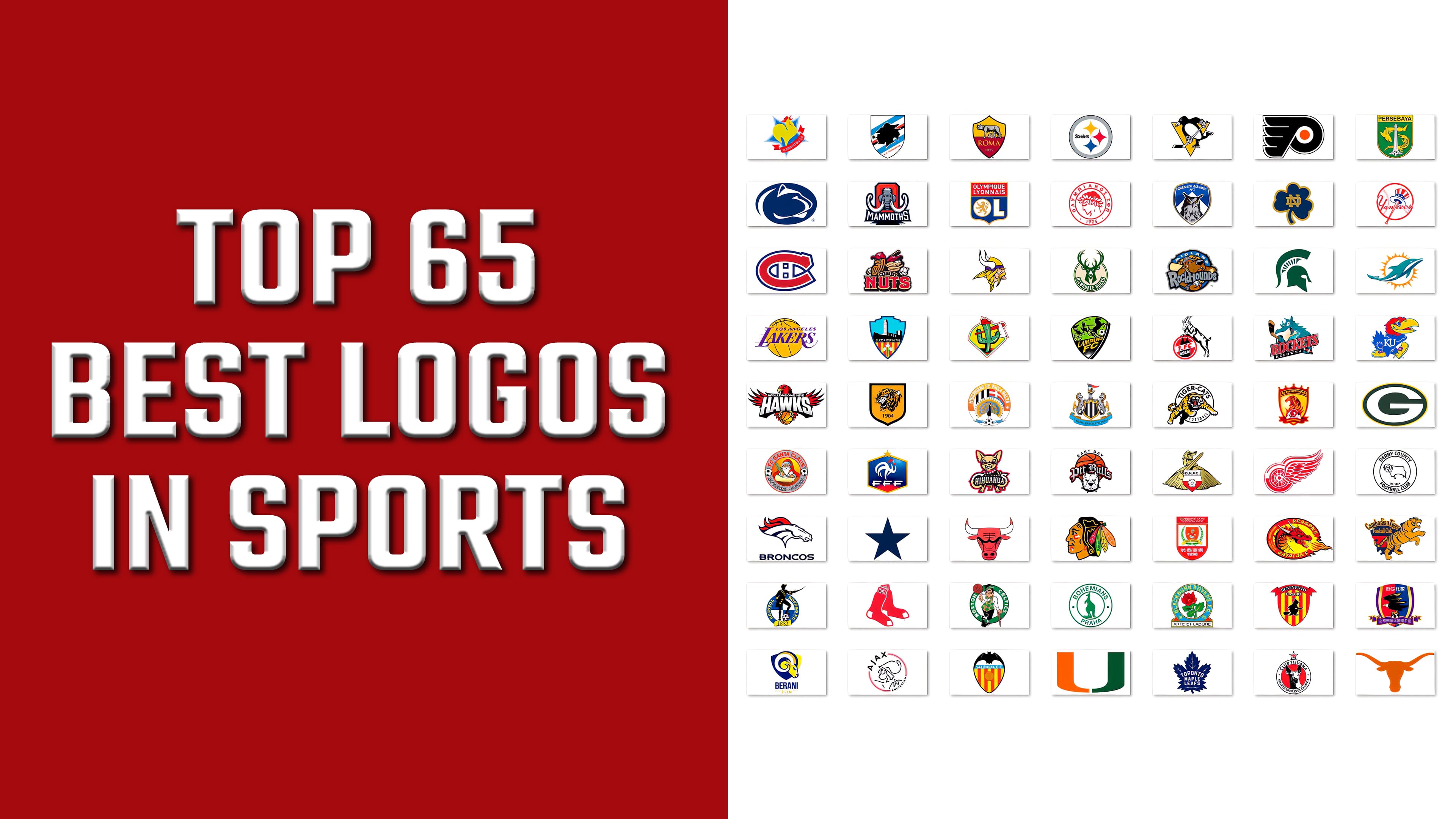
What are the top 65 best logos in sports?
It is a selection of the top 65 logos from around the world of sports. The first ten places are occupied by club emblems for the New York Yankees, Bristol Rovers FC, Montreal Canadiens, Newcastle United, Dallas Cowboys, Hibernians FC, Notre Dame, El Paso Chihuahuas, Los Angeles Lakers, and Kelowna Rockets.
The emblems include various elements that reflect the essence of the teams. They depict mascots, landmarks of the places where the organization was formed, and a reflection of past successes. However, to stand out among many similar options, you need to find the zest that makes the visualization unique and implement a design idea that captures attention, is easy to remember, and is recognizable. This selection comprises only 65 of the most unique, beautiful, and original logos, cherished and recognized by all sports fans, supporters, and participants worldwide. However, this is by no means an exhaustive list.
Bohemians Praha
![]()
The soccer club Bohemians from Prague (Czech Republic) has an original round emblem. Made in green, the soccer field symbol features an accent figure in the center of the inner field, a kangaroo. The unexpected symbol was a tribute to the team’s memorable tour of Australia in 1927. Inside the double circle, echoing the figure’s contours, is the team name and the city of its formation.
Derby County
![]()
The medal-shaped emblem of Derby County Football Club features a sheep as an accent; the animal’s black-and-white contours occupy the central space within the small circle of the sign. The head’s tilt and the body’s position symbolize the readiness to take a blow, persistently striving only for victory. Below the sheep is the date the team was created. The team name occupies the inner space between the circles. The emblem is in one monochrome color.
Denver Broncos
![]()
The Denver Broncos, a representative of American professional soccer, chose an original symbol: the head of a horse with a waving orange mane and a “bloodshot” eye. The rest of the silhouette is black and white. The dynamics of the head speak of determination and, at the same time, a threat to all who stand in its way to victory. Below is the team name in lowercase, bold serif font.
Hull City
![]()
Among the original sports logos, the emblem of the English soccer club Hull City stands out for its animalistic orientation. Its “roaring tiger” on an amber shield is the team’s mascot, rendered with high artistic quality in black and white. The logo’s color scheme is carefully chosen to match the uniform’s colors. The club’s creation date is indicated under the animal’s muzzle. The shield’s border is black.
Penn State
![]()
A somewhat unusual transformation of the Penn State mascot, the proud lion. In 2001, the Nittany Lion logo was updated by preserving the original color shades and mascot. However, the lion acquired definite features of a lioness, as depicted in the profile. The rather blurred features of the animal’s head and neck, set against a deeper navy blue, gave Penn State’s visual identity a bad impression.
Boston Red Sox
![]()
The story of the transformation of the Boston ReSox’s logox, is very interesting. Today, its emblem is the letter “B,” the first letter of the name. The emblem is a pair of red socks. The emblem and logo incorporate the team’s primary colors, navy blue, red, and white. The socks and letters formed the basis of the club’s visual identity. However, over time, the socks have changed in order and appearance, and the letters have changed in execution.
Persebaya
![]()
Indonesian soccer club Persebaya chose a crocodile and a shark as mascots and placed them on its crest. Guarding the city symbol, the lighthouse is positioned in the foreground, demonstrating its effectiveness in protecting the city’s interests and its gates. Predatory “guards” are symbols that reflect the team’s game style, demonstrating cunning, toughness, and surprise. The ball at the base of the lighthouse emphasizes the sporting character.
Milwaukee Bucks
![]()
The Milwaukee Bucks basketball team chose a noble deer as its mascot. Since its 1968 appearance as a cartoon character, it has evolved into a modern, noble yet aggressive version. A proud head framed by a crown of branching antlers breaks the circle of the emblem. The silhouette is made in a dark green team uniform. It towers above the name, made in white on a dark green plate.
Changchun Yatai
![]()
Chinese soccer club Changchun Yatai made this list thanks to its mascot, a cartoon horned duckling on a red shield background kicking the ball. The emblem features a red shield with a white inner field and a smaller shield, the duckling framed by a green laurel wreath. On a yellow ribbon is the inscription Yatai FOOTBALL. In the lower red sector, there is a white Chinese inscription with the club’s founding date. Above the main shield, in a red rectangle, the team’s name is written in white.
Pittsburgh Penguins
![]()
The Pittsburgh Penguins, an NHL hockey team, use an animal emblem: a cartoon penguin holding a stick, gloves, and skates. It is depicted against a downward-pointing yellow triangle. The character’s lack of a helmet is a comical reference to the love many NHL professionals have for playing on the ice without this mandatory piece of equipment. The colors of the emblem perfectly match those of the athletes’ uniforms.
Omaha Mammoths
![]()
The Omaha Mammoths, a professional soccer team based in Nebraska, chose a mammoth, the largest and most powerful of prehistoric animals, as their mascot. The illusion of the moment when the mammoth emerges from a faceted gemstone, a red rectangular carbuncle, is very effective. Under its tusks, on a black plate with elongated corners, the team’s name is inscribed in white; below it, the city’s name is in red.
Shanghai Shenxin
![]()
The logo of the Chinese professional soccer club Shanghai Shenxin is distinctive and serves as a mascot. Its emblem is a silhouette of a golden rooster against a blue five-pointed star background. A red crest, goatee, and ribbon, thrown over two-star rays, immediately attract attention to the composition. The club name is printed on the white ribbon. The golden color symbolizes the Earth and its constancy.
Beijing Enterprises
![]()
The Beijing Enterprises logo of the Chinese soccer club is notable for its impact and brightness. A proud eagle holds a ball in its paws against the background of a shield with a banner at the bottom. The emblem uses the team’s colors purple, red, blue, and gold. The edges of the shield and the space between the ribbon and the shield are purple. Gold frames the eagle’s wings, and the two ribbons run down the shield and cover the two sectors of red and blue.
Tampa Bay Buccaneers
![]()
An unforgettable logo of the American professional soccer team, the Tampa Bay Buccaneers. Brevity and originality are essential for attractiveness and memorability. Skull and swords, a bright red flag, and an American soccer ball in the form of a crossing of two swords. A flying red flag with a black border on a pirate saber adds the necessary visual appeal to the composition.
Benevento
![]()
Effectively selected elements of the emblem of the Italian soccer club “Benevento.” The emblem is a shield made in the club’s colors, red and yellow stripes. Its upper part is topped with a red ribbon with the team’s name written in white letters. The central element of the composition is the mascot’s silhouette. The black silhouette of a witch flying on a broomstick against a bright background makes for a memorable image.
Hamilton Tiger-Cats
![]()
One of the most beautiful logos in Canadian soccer is the Hamilton Tiger-Cats team emblem. Its tiger, depicted jumping, is very realistic. Its yellow coloring, black stripes, and white details add to its naturalism. The scalp of the animal’s muzzle is so natural that it creates the necessary visual effect, which is enhanced by the red-black color of the open mouth. The club name is inscribed above the animal’s head.
Olympiacos
![]()
The Olympiacos emblem pays homage to Greek tradition, history, and sport. It features a double-circle medal, the center of which depicts a crowned head. The team name is engraved between the circles, and the year of its foundation is written below. The logo uses a rich red color, characteristic of the team’s uniform.
Las Tunas
![]()
The emblem of Las Tunas, the Cuban national soccer league, immediately signals its country of origin. A cartoonish green cactus wearing the team’s red baseball cap carries a huge axe on its shoulder. The logo stands out with its extravagance, light-hearted humor, and high-quality, detailed drawing. The character is depicted against a shield with a yellow field and a symbolic red Earth image.
Cambodian Tiger
![]()
The ferocious Cambodian tiger is the mascot of the Cambodian national soccer team. Skillfully and beautifully executed against the general background, the beast standing on its hind legs and grinning menacingly makes a strong impression. Behind him is a stylized map of the country, made in the black and red colors of the national flag. Along the top arc of the map is the club’s name in black letters, bordered by a tiger skin.
Oldham Athletic
![]()
The British soccer club Oldham Athletic has chosen an owl named Cheddi, after its own name, as its mascot. Since 1885, it has undergone several changes in appearance, acquiring a modern, beautiful look that now occupies a central place in the club’s emblem. The emblem, designed as a shield, features a figure in the inner field, represented by a white triangle, with space above it.
Tijuana
![]()
The Mexican club “Tijuana” chose to embody strength and fury in its emblem, selecting the Xoloitzcuintle, a distinctive Mexican hairless dog breed, as its mascot. It is also a symbol of Mexico, as it has been known here for over 3,000 years. The emblem is circular, with a five-pointed red star outlined in black above the top circle. The dog’s head is centered on a red background. The club name and the dog’s breed are inscribed between the outer and inner circles.
Toronto Maple Leafs
![]()
One of the Canadian hockey teams is the Toronto Maple Leafs, based in Toronto, one of the country’s most populous cities. By adopting a dark blue “maple sign” logo, the team demonstrated its identity and conveyed a sense of tradition and heritage. The emblem characterized almost everything about the club’s home and courage; it had to remind us of its exploits and its overcoming of difficulties. However, winning significant prizes, including the Stanley, was impossible until 1967.
Lleida
![]()
The Spanish club “Lleida” chose the attributes and image of the eponymous city as its symbol, which it defends with sporting honor. The emblem looks very beautiful and aesthetic. The shape of the city shield encloses the city’s symbol, La Seu Vella de Lleida, located in the upper half of the figure. In the center, the name is inscribed in white font. Underneath are elements of the city’s heraldry, featuring red and yellow stripes on which the trefoil image is applied.
Aukro Berani Zlin
![]()
The Czech ice hockey team Aukro Berani Zlin uses a mascot in its logo, which is incorporated into the team’s name. The image of a ram’s head in the team colors of blue and gold is an integral part of the shield, as revealed by a closer examination of the composition as a whole. The drawn expression of the ram’s muzzle very accurately conveys the essence of the club’s name.
Minnesota Vikings
![]()
Among the leaders of American soccer in the National League, the professional club Minnesota Vikings stands out for its bright, original emblem. The image of the head of an old and experienced Viking very accurately conveys reckless impulse, action, and readiness to respond and win. The symbol is made in the club’s colors. The helmet, hair, and mustache are gold. The helmet’s horns are white. The helmet ribbon is dark brown.
East Bay Pit Bulls
![]()
The company East Bay Pit Bulls has created an original and clear emblem that immediately identifies its owner, represents the breed, and indicates the sport the owner is engaged in. The central element is the head of a pit bull in a spiked collar, above which the club’s name is written in gothic silver-gray font. In the background of the composition is a basketball, above which the first two words of the name East Bay are printed in a circle.
Modesto Nuts
![]()
The original emblem was created by the Modesto Nuts, a small baseball team from the city of the same name. Despite its low profile in sports outside the city, it attracted many with its cheerful emblem. The cartoon image of a nut and a peanut wearing club baseball caps with a bat and a ball in hand proved very attractive and memorable. The inscription with the club’s name placed underneath them is in the style of the names of the delicious peanut desserts on their packaging.
Spain national team
![]()
The emblem of the Spanish national soccer team is characterized by its fidelity to historical traditions and adherence to the rules of heraldic construction. Even the world’s leading heraldic scholars cannot find any flaws in its correctness. It has everything required for such a symbol: a shield, columns, a crown, and additional elements. At the same time, it is placed in its proper position in accordance with the requirements. Even a modern retro ball at the bottom and a golden star crowning the entire composition.
Doncaster Rovers
![]()
The English soccer club Doncaster Rovers has an emblem that is not typical for organizations in this country. The club’s emblem is crowned by a golden Viking, depicted in profile, with a sword of the same color slung over his shoulder. On his head is a “winged” helmet. In the foreground is a white-red shield, the colors of the soccer team, with the club’s full name, D.R.F.C., abbreviated in the upper part. The lower part of the emblem, situated on the border between two colors, features a white Yorkshire rose.
Pittsburgh Steelers
![]()
Originality and the unexpected are often found in “image circles.” This also applies to the Pittsburgh Steelers’ visual style. Pittsburgh is the home of the American Iron and Steel Institute. The Pittsburgh Steelers, a professional football team founded in 1933, is a franchise. Under it, the right to the main emblem was acquired. On the left was the word “Steel,” denoting the institute’s characteristics, and on the right were asteroids symbolizing the steel’s basic composition.
Miami Dolphins
![]()
The Miami Dolphins’ mascot, founded in 1966, is the cutest among the attractive emblems of American soccer clubs. A cheerful little dolphin leaps into the air against the background of the sun. The composition consists of the team’s colors: orange, white, and blue-green. In various versions, the emblem features a white or blue-green background and the mascot.
Roma
![]()
Roma, the Italian club in the capital, underwent a complete rebranding in 2013. The new emblem retained a commitment to history. The updated version of the Eternal City shield, featuring the club’s colors of gold and red on the inside, includes the city’s historical symbol: a she-wolf nursing Romulus and Remus. Beneath this symbol, in large, gold lowercase letters, is the club’s name, with the year of its founding in white numerals.
FC Santa Claus
![]()
Although the Finnish “Santa Claus” is called Joulupukki, the Finnish soccer team from Lappi chose to name its mascot after an American Santa Claus. The emblem consists of two circles, the contours of which are made in the red color of the club. The central composition depicts Santa Claus writing a letter. The free space between the outer and inner circle is occupied by the club’s name, made in red color, and the text, separated by the image of a ball, ARCTIC CIRCLE. LAPLAND.
Kansas Jayhawks
![]()
The University of Kansas’s team logo is unique and appealing. The team is led by a cartoon character, a cheerful, predatory raven wearing yellow men’s buckled shoes. The club’s primary colors, red and blue, were used to create the mascot. The Kansas Jayhawks logo features the team’s initials in white lettering at the center of the chest.
Catalans Dragons
![]()
Catalans Dragons, the French rugby team, stands out among French sports clubs for the originality of its emblem. The original execution is memorable, thanks to bright colors that echo the club’s palette and a unique mascot that makes it easier to recognize. The fire-breathing dragon, chosen as the emblem, provided the necessary visual effect. Its head, spewing fire, demonstrates the threat and readiness to fight until complete victory.
Köln
![]()
The German soccer club Cologne from North Rhine-Westphalia has one of the original logos. It is characterized by simplicity and brevity. Within a bright red circle, Köln’s symbol appears in black. In the foreground, in red font, is the inscription “1. FC”, which speaks for itself: “Our club is the first!” Above the city rises a formidable yet attractive goat, the team’s mascot since 1957. He is named Hennes, in honor of head coach Hennes Weisweiner.
Sampdoria
![]()
The image of a sailor on the logo of the Italian professional soccer club Sampdoria from Genoa makes it a unique identifier. The chosen symbol is a tribute to the club’s location in the port city. The outline of a sailor in profile with a pipe in his mouth is drawn in black on diagonal stripes of white, blue, red, and black, corresponding to the club’s colors. The emblem is rendered as a shield, effectively emphasizing the composition.
Valencia
![]()
The emblem of the Spanish soccer club Valencia is distinctive. The bat, depicted in black, occupies the entire upper part of the emblem. In the center of the emblem are vertical yellow-orange and horizontal blue stripes, taken from the city’s heraldic shield. The most important detail of the emblem is the retro ball. Thanks to fans’ persistence, the ball was retained after repeated changes, giving the emblem a memorable, original character.
Midland RockHounds
![]()
The Midland RockHounds logo is among the most distinctive and expressive emblems in Texas minor league baseball. The design features a massive brown bulldog holding a bat and a ball. His fierce expression conveys determination and readiness to overcome any rival. In the foreground, stylized gray letters form the team’s name, while the word Midland the city the club represents, appears in the upper part of the composition against a blue background. The entire image features a cartoon-inspired character, giving the emblem a memorable, energetic visual identity.
Equipe nationale de France
![]()
The French national soccer team has an unusual, bright, colorful, and unique logo. Such epithets he owes to the Gallic rooster, which symbolizes the country. In its original form, it is presented against a background of the national colors blue, white, and red. In addition to the rooster, the French Football Federation FFF abbreviation is in the foreground. The emblem is crowned with a golden star symbolizing the national team’s victory at the 1998 World Cup.
Illawarra Hawks
![]()
The Illawarra basketball team from the Australian city of Wollongong introduced its old emblem in 2007. The emblem’s main attribute was a hawk with large, outstretched wings, holding a basketball in its talons. His formidable appearance makes it clear to everyone that no mercy in the fight is worth waiting for. In the center of the composition is the name of the club. The emblem is red and white, corresponding to the team’s colors.
Olympique Lyonnais
![]()
The emblem of the French professional soccer club Olympique Lyonnais is distinctive. It can be called a veteran of logos. Since 1950, its visual appearance has remained unchanged. It is depicted as a white, red, and blue heraldic shield, representing the team’s colors. The shield is divided into two parts. The letters “OL” are on a blue background in the lower one. Inside the letter “OL” is a lion, the symbol of FC. At the top, the team’s name is written in red.
Michigan State
![]()
Michigan State University’s athletic interests are represented by the Michigan State Spartans, a team composed of 23 students from the university. The team’s mascot is the Spartan warrior Sparty, whose helmet is painted on the athletes’ uniforms. This is especially true of the helmets worn by soccer teams, where part of the helmet is cut off by the defense’s fastening, leaving some spectators bewildered. The main colors are green and white.
Chicago Bulls
![]()
The Chicago Bulls professional basketball team is renowned throughout the sports world for its game and its legendary logo. Since the club’s founding in 1966, it has undergone several changes in its appearance. Currently, it is depicted as a fierce bull’s head with powerful, sharp horns, reflecting the team’s readiness to fight to the last for victory. The combination of white, red, and black reflects the team’s color scheme. An interesting aspect is the attempt to view the bull from an upside-down perspective.
Philadelphia Flyers
![]()
The Philadelphia Flyers, a professional hockey team based in Philadelphia, Pennsylvania, have a distinctive logo. The logo is based on the letter “P” to represent the city’s name. In the center is an orange circle representing a hockey puck. The four wings on the left symbolize speed and movement in the sport. The palette used to create the logo was chosen to match the club’s color tones.
Guangzhou Evergrande
![]()
One of the most iconic emblems of Chinese soccer is Guangzhou Evergrande’s logo. A fiery, bright red tiger with a formidable, relentless look conveys the spirit of the whole team: always attacking and winning. In the foreground is a red ribbon with the club’s name, “Guangzhou.” Behind the ribbon, the ball is visible. In the upper part, the slogan “Be the best forever” characterizes the club’s identity and mood. The entire logo is composed of bright, memorable colors.
Blackburn Rovers
![]()
Blackburn Rovers is an English professional soccer club considered one of the country’s oldest. It was established in 1875 in the English town of Blackburn in Lancashire. The club’s emblem is designed in a traditional English style. A scarlet rose in a blue circle symbolizes the county of Blackburn. The club’s foundation date and name are displayed on a blue background within a circle. Below is the club’s motto, “Arte et Labore,” written in Latin, reflecting the team’s essence.
Texas Longhorns
![]()
The men’s basketball team, the Texas Longhorns, representing the University of Texas, has a seemingly simple but original and memorable emblem. It depicts one of the most famous Texas Longhorns. He is a symbol of both the state itself and the basketball team. Due to its large size and intimidating appearance, the longhorn, which can reach 180 cm, can be a formidable opponent. The logo’s color matches the team’s primary color.
Boston Celtics
![]()
The Boston Celtics team emblem cannot go unnoticed. It is made in white and green tones, the team’s colors. At the center of the composition is the team’s symbol: a cheerful, cunning leprechaun. He is in a hat and vest, with a pipe in his mouth and a ball rotating on one finger. Leaning on a cane and impressively stepping one foot over the other, the leprechaun looks quite imposing and memorable. Black monochrome is used for contrast and appeal.
Green Bay Packers
![]()
Since 1919, the Green Bay Packers, a professional football team based in Green Bay, Wisconsin, have represented the city. The team has attracted attention for its athletic accomplishments and its emblem. Although the Packers’ emblem is represented by a single letter that attracts little attention, the Packers’ G symbol deserves it. The white lettering on a dark green background with a yellow border, the club’s colors, is the most visually appealing.
Ajax
![]()
The emblem of the soccer club Ajax stands out for its simplicity and abstract design. An original portrait of a Greek mythological hero occupies the place of honor on the logo. Eleven lines of “Ajax” symbolize the team of eleven players. Above, on the red stripe, the FC’s name is written in large black letters. On the opposite side of the club is the city’s name, “Amsterdam.” The red-and-black palette for the logo echoes the club’s colors.
Detroit Red Wings
![]()
The Detroit hockey players applied a literal visual interpretation of their club for their visual identity. Naming themselves the Detroit Red Wings, they added a wheel and wings to their logo, which confirms the name. The wheel symbolizes the motor, which symbolizes Detroit, the city of Motor City. The wings symbolize the team that makes everything “fly” to achieve victory. There have been no changes to the logo since joining the NHL’s top six.
Lampang
![]()
The soccer club from the province of Lampang in Thailand attracts fans through its play and its distinctive emblem. Reminiscent of a guitar pick, the emblem is a chariot, “taking off” on its front wheels from a horse in harness, racing after the ball. It is a tribute to the team’s name, the Emerald Chariots. The upper half of the emblem is set on an emerald background. The lower half is black. It features the team name in gold and a white rising sun.
University of Miami
![]()
The University of Miami logo, located in the heart of Miami, or more precisely, the symbol of the university’s athletic teams, has retained the two-color palette adopted in 1971. This has had a positive impact on the club’s visual appeal. The logo fully meets modern requirements, featuring the letter “U” from the word “University.” It is simple, concise, and easy to remember. The letter is composed of the team colors: dark green on the right and orange on the left.
Chicago Blackhawks
![]()
The Indian head on the Chicago Blackhawks’ emblem is not only original but also distinctive. It is also the subject of heated discussions about disrespect for national minorities. The club’s logo, brightly painted in red, white, and black, has long represented the team’s history. The head belonged to the famous chief of the Sauk tribe, who lived in the XVIII-XIX centuries in the territory of the present state of Illinois. The team name is a tribute to owner McLaughlin, his 86th Infantry Division Blackhawk.
Kelowna Rockets
![]()
One of the great logos is the visual identity of the Western Hockey League (WHL), a junior hockey league based in Kelowna, British Columbia, Canada. Since 1994, the club’s emblem has featured Ogologo, the mythical monster of Okanagan Lake. He is sly and fun despite trying to look menacing. A small dragon with a hockey stick, the club’s name consists of all the team’s colors.
Los Angeles Lakers
![]()
The world-famous basketball team, the Los Angeles Lakers, is not only known for its bright play. The team’s emblem is memorable and bright. The combination of such difficult “get along” shades of purple and gold brought the club’s emblem to the forefront. The club explains these colors by associating them with royal or imperial personages. They are used on purple capes as a symbol of power and on gold crowns.
El Paso Chihuahuas
![]()
The state of Texas surprised its baseball fans with an original team logo. The small club, the El Paso Chihuahuas, was named in 2013 in honor of the state of Chihuahua and is located near the Mexican border in El Paso. The team’s mascot is an angry Chihuahua puppy who tries to intimidate the team’s opponents and prove he’s a good guy, too. To prove it, the dog was “equipped” with a spiked collar, and its vicious grin was depicted on the emblem. The emblem features all four of the team’s colors.
Notre Dame
![]()
The University of Notre Dame team represents America’s favorite sport with an original, memorable emblem. The story of the new emblem began ten years after the club’s disintegration. The uniform shield is designed in the team’s colors: navy blue, green, and white. In the inner field, in the upper part, is a black, color-printed team abbreviation. The central elements are the Celtic cross, the date of the team’s formation, the signs “N” and “D,” and the trefoil, the symbol of the disbanded club.
Hibernians FC
![]()
The professional soccer club “Hibernians” from Paola (Malta) can be considered the owner of the most original emblem. In the center, standing on the ball, settled a gracefully fluttering peacock. An inscribed name is positioned around the circle on a white-and-yellow background. Below is a tribute to the historical heritage, presented as a Maltese cloak featuring a white cross on a red background. Next to it are black-and-white stripes in the club’s colors. On the bottom ribbon, the date the club was founded is shown.
Dallas Cowboys
![]()
Interestingly, there are common human errors in assessing one’s capabilities in team sports. The Dallas Cowboys, a team founded in 1960 and competing in the NFL, have no qualms or worries about their lack of meaningful athletic accomplishments. Change Needed: The club from Arlington, Texas, is in no hurry to spend more than 55 years on its game or logo. After all, a blue or red star looks very winning on sexy women’s boots.
Newcastle United
![]()
The emblem of Newcastle United, an English soccer club, is unique and beautiful. Two mythical seahorses with fish tails symbolize Newcastle-upon-Tyne, over the river and sea. The tower on the coat of arms symbolizes the city’s early history. The coat of arms is in the commanding colors of white and black. At the top of the tower, a lion is depicted holding a pennant bearing the Cross of St. George. A blue motto ribbon with the club’s name is at the bottom of the emblem below the coat of arms.
Montreal Canadiens
![]()
The famous logo of the Montreal Canadiens hockey club holds a palm of superiority due to its virtually unchanged visual appearance. Since its founding in 1917, the club has consistently maintained its brand, demonstrating confidence in its ability to win while upholding its image as a leading brand. Two simple letters, “C” and “H” (“club” and “hockey”), are enough to recognize the leader.
Bristol Rovers FC
![]()
The pirate saber ball, originally featured on the logo of the English soccer club Bristol Rovers, reflects Bristol’s maritime history. The circle in the background is white and blue, with squares that symbolize the team’s primary color scheme. Around the emblem’s circle, on a blue background, the name “FC” is inscribed in yellow letters. An accent element of the emblem is a bright yellow motto ribbon bearing the club’s foundation date.
New York Yankees
![]()
One of the most complex logos is the New York Yankees’ emblem. The interweaving of lines was created so precisely when forming the abbreviation for the NY team that it provided a clear visual. The emblem is shaped like a balloon. The interior space is filled with the club’s name, Yankees, in handwritten script. The foreground depicts an “Uncle Sam” hat worn on a baseball bat.