Industrial construction is a niche completely far from creativity. These are clarity, consistency, algorithms, security measures, compliance with norms and order. When they say that this or that large company is rebranding, one would like to hope that, together with the external rigor of the stated brand positioning, there will be at least some hope for an easy and recognizable creative image.
Every large business person or influential figure knows that the most important advertising weapon is a well-built visual communication with the audience, which is the basis for the loyalty of customers, trust, and, in general, the demand for a particular product.
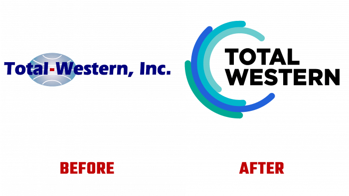
Founded back in 1972, the pretentious name Total-Western has confidently entered the era of a new transformational business. This brand is engaged in industrial construction, providing turnkey life cycle services. On the eve of its 50th anniversary, the company decided to refresh its visuals, making the audiences very happy.
The range of services provided by this company (aerospace, manufacturing, and energy) are just some of the areas of a wide range of vectors of the company’s activity. This year the company announced a large-scale expansion, and they wanted to celebrate the new financial year with an updated appearance to show the prospects and dynamics of their changes.
The four components that make up the new design construct symbolize the four service offerings of the company. Design, assembly, operation, maintenance are the four pillars on which the world of Total Western is based. The brand wanted to show its algorithmic, consistency, and structure in the new design, so the idea conveyed the stepping, gradation. They reflect the company’s ability to provide services and expertise in different areas and stages of the project life cycle.
The new logo looks like the outline of a circle that partially encloses the black font of the company name. Circular lines are created in three shades of blue and green, close to the shade of a swamp. Blue is represented by shades of delicate greenish-blue, which can be confused with pale green, like the color of a petal, and muted turquoise and bright Prussian blue.
The cyclical nature conveyed by rounded lines, as if revolving around each other, testifies to the life cycle of a particular project, visually convinces the viewer that all stages are interconnected and organic.
The key idea is that a continuous process of creating, maintaining, supporting, and controlling a project is perfectly transmitted; therefore, such a visual solution inspires confidence and convinces the brand’s reliability.
Of course, one can doubt the correctness of the choice of colors, ask questions about the greenish shades. But the answer will be extremely simple – in the psychology of color, green means growth, profit, prosperity.
Therefore, the total renewal of the Total Western identity is a bold step towards the large-scale transformation of the business.


