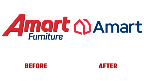
Earlier this year, the Australian company Amart Furniture, which has about 70 stores across the country, introduced a new emblem. Founded in 1970, this brand has come a long way toward a modern visual identity – simple, symbolic, and deep.
The furniture brand has been helped through its incredible evolution by McCartney Design, which has been working with the brand for more than eight years, making it possible to accurately demonstrate the essence of the ambitious plans to update the identity. The logo Amart Furniture turned out to be stylish, despite the geometric design, consisting of one continuous strip.
A new version – graphic text. It harmoniously combines the name and symbolism of the store. Moreover, the sign aptly indicates the company’s type of activity because it encodes a classic house – a quadrangular, oblong, with a gable roof. To do this, the specialists superimposed an imaginary line on the base points of a standard building and redrawn them, obtaining a stylized image. It perfectly captures Amart’s goal of turning shopping into an inspiring journey.
- The three-dimensional emblem shows the breadth of services and the huge range of products offered since the brand supplies furniture and other products.
- The concept of a house sign is also connected with the fact that the company strives to show how easy it is to equip not only one room but the whole house with the help of its products.
- Moreover, going to the “blue box” (this is what branded points of sale look like) should help realize what style housing should be in and inspire buyers to implement it.
This is the primary task of the manufacturer, conveyed through the new logo. The palette is also subject to this principle: it has become much more attractive, brighter, and more tempting. Flashy colors effectively complement the image. The same goes for typography. Designers have replaced the wide font with a narrow and elegant one. By the way, the second part of the name has disappeared from the modernized logo: only the first and main word remains – “Amart.”


