In recent weeks, many brands have revived and announced their rebranding. Either this is such a fashion, or an urgent, urgent need, or just peeping at competitors – it’s hard to understand.
Most likely, when the company’s employees are tired of their “stale” logos, dull and outdated elements of the identity, they complain about the lack of attention to the brand, then the “wind of change” mode is turned on.
For example, the public transport company Translink recently unveiled a new logo design that cost a round sum, namely £ 15,000. Did you get paid for the simple visuals? It is necessary to understand this; otherwise, the brand runs the risk of being ridiculed.
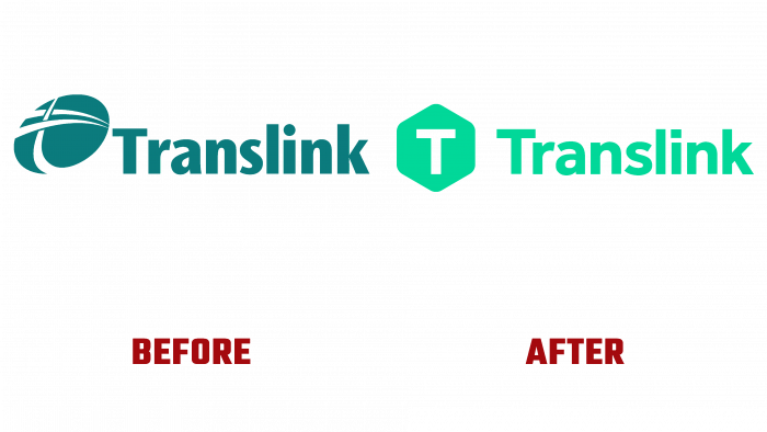
Perhaps the idea of rebranding consisted of broadcasting a qualitatively new idea; in fact, it turned out to be simple and uninteresting. A stylized “T” was glued inside the white hexagon. The general background is forest green, rich and beautiful. But the font, as if they were not trying to change, at least barely discernible transformations.
Many users responded to the update very negatively. They did not hide their sarcasm: how could you pay such a huge amount for a simple letter in a geometric figure that looks like the work of a child who has just mastered a graphic editor?
Translink itself is in financial disaster. Surely the brand has started the renovation to attract more investment because they have recently faced serious financial problems and reduced their services. In response to malicious smirks and malicious comments, the company responded that the new design helps “modernize and simplify the brand’s presence.”
And, if you look from the other side, is it worth creating a painting instead of just a monogram and trying to promote it to the target audience?
The former logo has been popular for 25 years and has undergone many changes. But it still stayed afloat and was always in the focus of attention of consumers.
Who created this very simple logo is McCadden Design, an agency based in Belfast. Different colors have been developed for different services, so they have significant differences in Ulsterbus, Metro, and NI Railways.


