TransUnion Logo

TransUnion LogoTransUnion Logo PNG

The TransUnion logo represents honesty and reliability. The brand provides information for secure business operations to thousands of organizations. Data collection and processing are conducted using unique methodologies. The emblem emphasizes the value of the company’s data and its uniqueness.

TransUnion: Brand overview

On February 8, 1968, the Union Tank Car Company established a subsidiary to manage its clients’ credit data, creating TransUnion. The founder, Mike Downey, identified the potential for a centralized system to streamline credit reporting.

In its early years, the organization focused on developing and implementing a computerized system for processing credit information. A significant step came in 1969 with the acquisition of the Credit Bureau of Cook County, granting access to a vast database of consumer credit histories in the Chicago area.

During the early 1970s, the company expanded its presence across the United States. By acquiring local credit bureaus and consolidating their databases into a unified system, it improved the efficiency of credit reporting. A milestone was reached in 1973 with the launch of an online system for distributing credit reports, dramatically reducing the time required to process credit requests.

Technological advancements and rapid growth marked the 1980s. In 1981, the organization became the first credit agency to operate a fully automated national database for storing and processing credit records. By 1988, it introduced fraud protection services, a key growth area.

International expansion began in the 1990s, with the company entering the Asia, Latin America, and Canada markets. Offices were opened in Hong Kong in 1992 and Brazil in 1995. New analytical tools for assessing credit risk were also developed during this time.

In the 2000s, new business areas emerged. In 2002, the company introduced real-time credit report updates. In 2005, it launched innovative methods to combat fraud and identity theft, further diversifying its services.

A major turning point came in 2012 when Advent International and Goldman Sachs Capital Partners acquired the company from Madison Dearborn Partners and the Pritzker family. This acquisition brought resources that enabled the organization to accelerate growth and innovation.

The company reached another milestone in 2015 with its initial public offering (IPO) on the New York Stock Exchange. The funds raised were used to advance technology infrastructure and support ongoing development.

From 2016 to 2020, the organization expanded its data analytics and cybersecurity capabilities through strategic acquisitions, including eBureau, innovation, and Callcredit Information Group.

Between 2021 and 2023, the company focused on advancements in digital technology and artificial intelligence. Significant investments were made in developing cutting-edge data security and analytics tools to address evolving market needs.

By 2024, the company had further advanced its expertise in data science, expanding its services to finance, insurance, telecommunications, and healthcare industries.

What began as a credit bureau has grown into a global leader in information and analytics, playing a vital role in the financial system. The organization maintains its position as a credit reporting and risk management leader by continuously investing in innovative technologies and expanding its geographic footprint.

Meaning and History

TransUnion Logo History

What is TransUnion?

This provides data and analytical insights essential for the modern credit ecosystem. The company collects and studies information about millions of customers and businesses worldwide. To assess a person’s creditworthiness for loans, credit cards, and other financial products, the company’s primary responsibilities include gathering credit reports and generating credit scores. It offers various data-driven business solutions, such as fraud detection, marketing services, risk management tools, and credit reporting. It can also provide analytical insights that help consumers manage their financial well-being and enable companies to make informed decisions through its extensive database and analytical expertise.

1969 – 2001

TransUnion Logo 1969

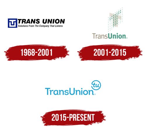
The history of the TransUnion logo begins when the company, part of Union Tank Car Company, acquired the Credit Bureau of Cook County a year after its founding. This event marked the creation of a visual symbol reflecting the new concept of a credit organization.

The emblem is a monogram featuring two capital letters stacked on each other, enclosed in a black cube. This design evokes several associations that emphasize the key aspects of the company’s activities:

  • Maze: The composition conveys the company’s ability to help clients find solutions to financial difficulties through loans.
  • Schematic Face: The monogram hints at the company’s role as a legal entity entering client partnerships.
  • Interaction: The logo reflects the connection and collaboration established during the credit process.

The geometric elements are evenly distributed, creating a sense of order, organization, and professionalism. These qualities highlight the company’s capability to manage processes efficiently and provide reliability to its clients.

The black cube framing the monogram resembles a safe, symbolizing protecting and safeguarding financial assets and confidential client information. Its solidity and stability reinforce the company’s image as a trusted partner capable of handling critical data and maintaining client stability.

1990s – 2001

TransUnion Logo 1990s

The logo was redesigned to be more compact. The letters are blue, emphasizing professionalism, a technical style, and consistency in operations. This highlights the company’s reliability and thoughtfulness. The figure on the left symbolizes the foundation built over years of prior activity.

The company name is in large letters on the right, showcasing its scale and achievements. Below them is the positioning statement: solutions from the company that listens. While this phrase does not fully encapsulate TransUnion’s work, it highlights attentiveness, a caring approach, and the ability to listen to the needs of partners and clients.

The logo update coincided with the acquisition of the Marmon Group brand, reflecting the need to refresh and modernize the corporate style while retaining the core elements of its identity.

2001 – 2015

TransUnion Logo 2001

In 2001, a new company logo was introduced, reflecting an updated vision of its activities. The design is based on two intersecting planes containing the letter “T.” One of the planes is depicted as a matrix of dots, resembling markers used for calculating credit scores. This element illustrates the process of collecting, structuring, and processing data, enabling the company to create accurate and informative reports for brands.

The intersection of the traditional letter with the digital design on the logo conveys the connection between the physical world and virtual space. This emphasizes how TransUnion collects, stores, and systematizes data, forming a comprehensive information base. The matrix of dots demonstrates the impact of collected data on client decisions and actions.

The color scheme, featuring green and pale brown tones, reflects parts of the company name displayed below the primary symbol. This combination enhances visual perception and makes the emblem cohesive, accurately conveying the organization’s data processing and analysis work.

2015 – today

TransUnion Logo

The acquisition of Trustev allowed TransUnion to enhance the accuracy of processed data and strengthen fraud protection. This achievement served as the foundation for the company’s rebranding. The new visual symbol is rendered in blue, with its lettering presented in thin lines, emphasizing the reliability and quality of the services provided.

Using a script font highlights the uniqueness of the generated ratings and the individualized data processing methods. This design element illustrates the company’s commitment to delivering highly accurate results based on modern techniques.

The first letters of the company’s name are transformed into a copyright symbol in the upper-right corner of the logo. This addition underscores that all data collected and processed using unique technologies is TransUnion’s intellectual property and constitutes a significant part of its professional assets.