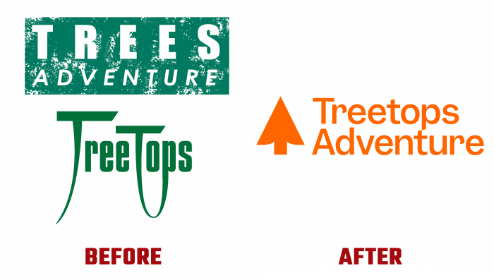
An Australian leisure company, Treetops Adventure, was founded in 2010 to organize a country parks network. They provide services for those who like to ride the ropes and ziplines. Today the company has already organized 13 parks equipped with wooden and rope pitches for trees, which do not interfere with the latter’s growth. The parks have well-thought-out trails for outdoor enthusiasts of all ages. The original name of the brand was Trees Adventure. But after buying a competitor in its field called TreeTops, the company decided to rename to improve visibility and provide information in the digital and print sectors more effectively. The new name allowed retaining the clients of the acquired company, making the brand more attractive. The brand’s new style was developed in collaboration with Melbourne-based design studio, Australia-based Self-titled.
Considering the merger of the two organizations and the fact that the purchased company had its members and admirers, an approach was required that could easily and without loss attract them to the new company, preserving the old and new contingent. It was decided to start with a name that would include the familiar elements of both brands. The new name was made up of the name of the purchased brand combined in one word and the second word of the company itself. In addition, this option provided a literal interpretation – the unity of the upward arrow and the tree. In digital representation, the sign is dynamic. Its constant changes demonstrate the diversity of visitors’ abilities.
The new logo incorporates a mix of attractive tree abstraction, serving as an upward arrow simultaneously. This is practically everything about the brand itself, its tasks, and its proposals. The Garnett by Sharp Type font chosen for the lettering bears confidence and a guarantee of reliability. At the same time, the original performance of the first letter “T” with small indentations in the upper part, on both sides of its “leg,” connects it with the arrow graphics, ensuring the unity of the entire composition. The combination of the “p” of the lower word with the “t” of the upper one, whose bevels of the legs provide visual perception of a single transition, is also original.
With the help of the new identity, it became possible to convey the key distinction of the brand – the presence of many directions and options, both taking into account the age and level of training of the participants and to ensure constant novelty for visitors. This was primarily due to the color palette used in a complex system. Arrows were also used as identifiers of the difficulty level, increasing as the program becomes more complex and obstacles.


