In 2001, a film festival brand called Tribeca was founded. Such famous cinema figures as Robert De Niro, Jane Rosenthal, Craig Hatkoff were directly at the festival’s origins.
This event has become widely known all over the world, more than 600 screenings are held annually, and about 150 thousand people are present at it. The coronavirus pandemic has made adjustments to the organization of the festival in 2020. This year it would be possible to celebrate the founding anniversary on a grand scale – after all, the festival is already 20 years old. Nevertheless, it was possible to celebrate in the open air, for the first time in 20 years, and even in all five boroughs of New York.
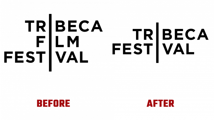
In connection with the expansion of the festival’s activities, it was decided to change the name, abandoning the “Cinema” part. Now included in the program are video games, podcasts, TV products.
The brand identity was handled by the Pentagram team together with Emily Oberman and her creative team.
The key idea transmitted to the viewer is the vibrations of the city, signals for open communication, and a willingness to open up their souls towards art. When everyone is tired of the hermetic way of life, which was trending in 2020, it becomes possible to enjoy new experiences and events thanks to the festival. The festival is more than a film. This is art, conversations, games, immersive performances, bright exhibitions. All this is focused on a new name – Tribeca. For home comfort and maintaining the festival’s image, various entertaining mini-events have become a real delicacy for a couch potato, which is used to sitting at home more during this time and looking for impressions on the other side of the screen.
When it comes to logo changes, everything is very simple. Graphic geometric design with two words instead of three (the movie part was removed), black color, a line that goes through the words and plays the role of the letter “i.” Not to say that it attracts attention at first sight, but something is alluring about it. They made a trademark from the brand, so its icon at the bottom of the word FESTIVAL is hidden under the L as an invisible spot.
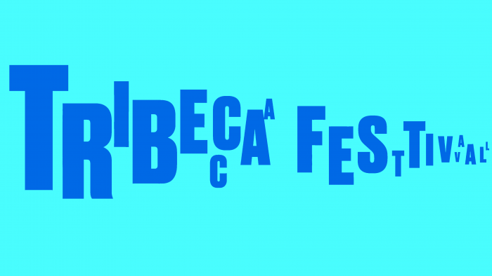
But the headlines, juicy and colorful “Tribeca Festival,” look like jumping and double inscriptions in advertising campaigns. By this, the authors of the design wanted to show the originality and originality of everything that awaits the viewer. A slightly playful and distinctive font, bouncing letters accompany all the advertising boards concerning the events and the original products of the festival.


