Trivago, a leading global platform for hotel and accommodation search, has unveiled an exciting new brand identity, marking a significant evolution in its market presence. The highlight of this transformation is the introduction of a refreshed Trivago logo skillfully crafted by DesignStudio. This move signals a new era for the Düsseldorf-based company, which has been a pivotal figure in the online accommodation search sector since its inception in 2005.
Trivago, known as Germany’s first hotel search engine, has undergone multiple transformations throughout its journey. Since joining the Expedia Group in 2013 and going public in 2016, Trivago has witnessed exponential growth, providing access to a vast array of hotels and accommodations across 190 countries.
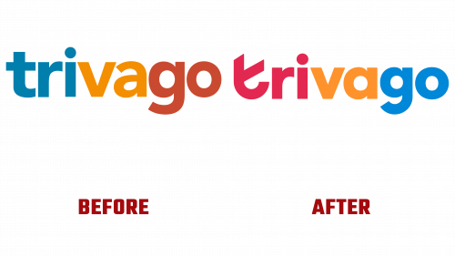
The latest iteration of the logo signifies a bold departure from Trivago’s previous visual identity. The old logo, featuring a tri-color, lowercase sans serif design, was functional but lacked distinctive character. The 2023 redesign infuses a new vibrancy into the brand’s image, retaining essential elements while introducing dynamic enhancements.
The refreshed logo maintains its lowercase orientation but is revitalized with a brighter and more dynamic color palette. It adopts a geometric sans serif font, with particular emphasis on the roundness of the letters in the brand name. The letter “t” has undergone a notable transformation, now sporting a round bottom and an angled arm, distinguishing it as a unique and recognizable brand symbol.
The redesign subtly incorporates a checkmark and a smile into the “t,” forming an ingenious monogram. These elements, though not immediately apparent, add depth to the logo, subtly reflecting Trivago’s dedication to customer satisfaction and quality service. The tri-color design of the monogram enhances its visual impact, making it a standout feature of Trivago’s branding.
Accompanying the logo is the introduction of a custom typeface. This typeface, featuring modern ink traps, adds a contemporary edge to Trivago’s branding materials, though its connection to the brand’s core identity may not be immediately evident to all viewers.
More than just a logo update, Trivago has also refined its communication style, adopting a more concise and engaging tone of voice. This change is part of a broader strategy aimed at differentiating Trivago in the competitive online travel market.
The new brand identity, highlighted by the vibrant Trivago logo, is a reflection of Trivago’s ambition to maintain its leadership position in the travel and accommodation search industry.


