The sign of the company is balanced and very harmonious as a believing person looks self-sufficient and calm, so the clothes of the brand create a complete image for the user. The True Religion logo symbolizes comfortable, practical, and versatile clothing for all times.
True Religion: Brand overview
| Founded: | April 2002 |
| Founder: | Kym Gold, Jeff Lubell |
| Headquarters: | Gardena, California, U.S. |
| Website: | truereligion.com |
Meaning and History
The brand lasted for a short time. Although its official opening took place in 2002, the release of the first batch of products began three years later – in 2005. By 2009, the company’s products were sold on all five continents: in 900 specialized stores in 50 countries. The flagship boutique appeared simultaneously with the launch of the clothing on the market – in 2005. It was located in the state of California – in the city of Manhattan Beach. Several large department stores also sold branded denim products, including Saks Fifth Avenue, Bloomingdales, Nordstrom, Von Maur.
The company’s commercial policy kept the price at a very high level, which led to bankruptcy. Firstly, in 2011 there was an incredibly low demand for True Religion jeans in the pre-Christmas period when the population makes the overwhelming majority of purchases. Secondly, the company’s shares fell sharply the next year – they fell by almost half due to the lack of interest in the product due to its increased value.
The decline continued until the end of autumn 2012, and in 2013 the company was acquired by TowerBrook Capital Partners. However, this measure turned ineffective, and the brand still went bankrupt, closing several stores in 2017. At that time, it was planned to revive it in 2020. But the brand did not live up to expectations: True Religion shares rose only 11.6 percent, while competitors’ shares more than doubled over the same period. Therefore, the company had no future, but only holes in the budget and two logos.
Old
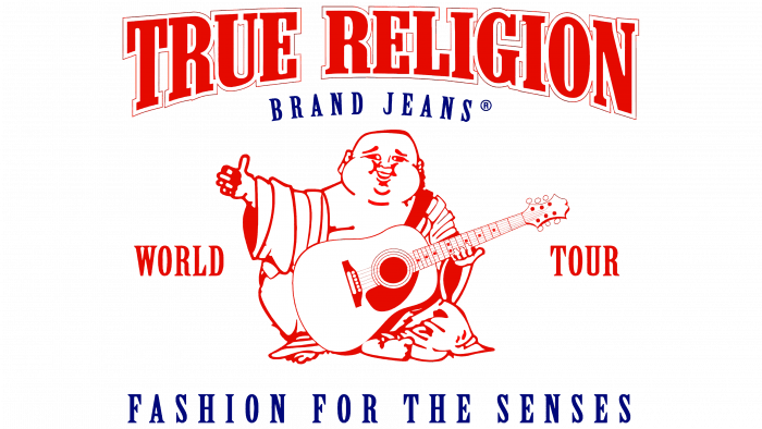
The debut emblem is multi-part. It uses graphics and text and an ordinary drawing: in the center, a Chinese man is sitting in a dressing gown and with a guitar. He holds a musical instrument with one hand, and with the other, he shows “class” – an outstretched thumb. This is how the character confirms the highest quality of branded products. A satisfied smile glows on his face.
To the right and left of the Chinese are the words “World” and “Tour.” They are red, straight, with small serifs. Below is the advertising slogan “Fashion for the senses,” executed in the same tall elongated letters but with wider symbols. Above the head in two lines is the name of the company, “True Religion” and the phrase “Brand Jeans.” The first element is large, with letters enlarged at the edges; the second is small, in the form of a small arch.
New
The modern graphic sign consists of a concave element, reminiscent of the capital letter omega from the ancient Greek alphabet, but inverted form. The icon also looks like a horseshoe since the brand is in financial trouble and subconsciously chose the symbol that closely resembles a horseshoe for good luck.
At the top, there is a large inscription taken from the old emblem. This is the brand’s name with multi-format letters: they are high at the edges and low in the middle, which is very similar to western-style signs. The horseshoe concept fits in perfectly here since both images are associated with the US Wild West. As before, the text is arched. The main colors of the logo are monochrome, consisting of black and white.
True Religion: Interesting Facts
True Religion Brand Jeans, created by Jeff Lubell and Kym Gold in 2002, quickly made a name in the premium denim scene. Known for its meticulous craftsmanship, unique vintage washes, and the famous horseshoe logo on the back pockets, True Religion stands out in the world of high-end jeans.
- Signature Stitching: The brand is famous for its bold stitching, often in contrasting colors, which looks great and makes the jeans more durable.
- Luxury Denim Forerunner: True Religion was among the first to introduce jeans as luxury items. Despite initial skepticism about the high price point, the brand managed to carve out a niche for premium denim with unmatched quality and design.
- Innovative Denim: They brought new fabrics and fits to the market, like the ‘Super T’ stitch jeans and ‘Phantom’ denim, offering a seamless look that stood out.
- Celebrity Favorite: Celebrities such as Megan Fox, Angelina Jolie, and Jessica Simpson have been seen wearing True Religion, helping to boost its popularity and establish it as a fashion essential.
- Worldwide Reach: Starting from Los Angeles, the brand has grown internationally with stores in over 50 countries, bringing its unique denim to people around the globe.
- More Than Denim: While famous for jeans, True Religion has expanded its line to include T-shirts, sweatshirts, activewear, and accessories, evolving into a broader lifestyle brand.
- Overcoming Obstacles: True Religion has returned despite filing for bankruptcy in 2017 and again in 2020, showing resilience and the ability to navigate the tough fashion industry.
- Exclusive Collaborations: The brand has teamed up with celebrities and other brands for limited-edition collections, enhancing its exclusivity and wide appeal.
- Digital Savvy: True Religion embraces digital marketing and social media and connects with a younger, tech-oriented audience through influencer partnerships and platforms like Instagram.
True Religion’s mix of quality, innovation, and distinctive style has secured its spot in the fashion world as a leading name in premium denim despite facing significant challenges.
Font and Colors
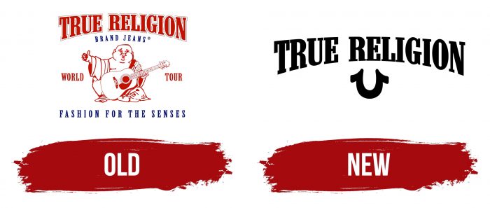
Both logos have only one element in common – the brand name. The old version is made with red symbols with edging; in the new version, it is made in black letters without additional decoration. The lettering is in the upper case and is arranged in an arch. Since the company ceased to exist, a third logo has not appeared, although it has planned a redesign for 2020.
For its personalization, the True Religion brand chose the Neo Contact Regular typeface. It is used in both the old and the new logo. The brand’s palette is also constant: it includes black, white, and red.
True Religion color codes
| Safety Red | Hex color: | #c20a1b |
|---|---|---|
| RGB: | 194 10 27 | |
| CMYK: | 0 95 86 24 | |
| Pantone: | PMS 485 C |
| 0d1f3b | Hex color: | #0d1f3b |
|---|---|---|
| RGB: | 13 31 59 | |
| CMYK: | 78 47 0 77 | |
| Pantone: | PMS 282 C |
