Сompleteness are reflected in the simple and pointed lines of the emblem. The Nordstrom logo represents everyday goods at an affordable price, without extravagance and pretentiousness. Department stores are a familiar place for relaxed daily shopping.
Nordstrom: Brand overview
| Founded: | 1901 |
| Founder: | John W. Nordstrom, Carl F. Wallin |
| Headquarters: | Seattle, Washington, U.S. |
| Website: | nordstrom.com |
Meaning and History
John W. Nordstrom (née Johan Nordström, an immigrant from Sweden) got rich during the Klondike Gold Rush, married an American, and started looking for some suitable business. In the end, he chose a shoe store, which he called Wallin & Nordstrom. As co-founders, he took a knowledgeable person – the shoe repair shop owner. A dynasty gradually emerged as Nordstrom had five children. Three of them inherited his business: he sold them his shares. Wallin did the same when he decided to retire.
At first, the company was run by two brothers. They improved the store and reconstructed its building. In 1933, a third brother joined them, and then relatives for about forty years jointly ran the company, still selling shoes. The situation changed over time, when department stores underwent a series of transformations, changed management, expanded, and formed a distribution network. In addition to footwear, other products have appeared in the assortment, allowing customers to dress literally from head to toe. That is why the stores have received the status of a full cycle.
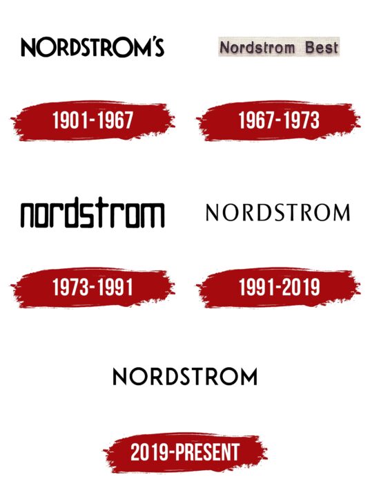
But they were united not only by the presented goods: there was also a single emblem, which served as a sign and took place above the entrances of all points of sale. In total, there are five types of logos in the arsenal. They are textual, then they converge but have completely different styles than they differ.
1901 – 1967
For the first six decades, the store used an “S” sign at the end, followed by an apostrophe. It meant that the brand belonged to people with the name Nordstrom. And it is – three brothers ran the company. The inscription was composed of capital letters – chopped, smooth, but not quite even. Some parts of the signs were just different in size. The largest was the “O”: they were perceived as large hoops. More massive than the rest also looked “M” and “N.” There was no background for the title – just white space was used.
1967 – 1973
The rebranding was the reason for the logo change, so the identity of that time was based on the name “Nordstrom Best.” Almost all letters were in lowercase, except for the first. The distance between the symbols has increased, while they themselves have become voluminous due to light shadows and gray backgrounds with small dots. Both ts had half of the bar cut off, and the s got a deep bend.
1973 – 1991
Lowercase characters dominated the emblem of that time. The apostrophe and “S” have completely disappeared from the name. The shape of the letters was rectangular, and they harmoniously matched each other in style and proportion. The symbols were rounded at the corners. They looked as if they were made one piece at a time with the removal of “unnecessary” parts. For example, “o” was full-length, while “n,” “r,” and “d” looked like fragments of it because they had almost the same look. Only “t” and “m” were knocked out: the first letter looked like a cross with an offset crossbar, and the second was perceived as a double “n.”
1991 – 2019
The symbols are again given a wide inter-letter space and a traditional form. After moving to the upper register, “O” became classically oval and “S” – wavy. This version of the lettering on the Nordstrom sign is recognized as the most sophisticated and elegant due to the smoothly widening and narrowing lines.
2019 – today
The modern logo features tapered lettering at the ends. This is seen in “M,” “N,” and “D.” The rest of the letters have smooth and blunt cuts. The “O” in this version of the identity is not oval or rectangular – it is perfectly round.
Nordstrom: Interesting Facts
Nordstrom, an upscale American department store, is known for its high-quality customer service and broad selection of products.
- Starting Small: In 1901, John W. Nordstrom and Carl F. Wallin opened a shoe store in Seattle, funded by Nordstrom’s $5,000 from the Alaska Gold Rush.
- Becoming More: From the 1960s, Nordstrom began selling clothes, accessories, jewelry, cosmetics, and more, growing from a shoe store to a full-scale department store.
- Customer Service: Nordstrom is famous for its excellent customer service. It offers personal stylists, easy returns, and free shipping for online orders.
- Trust in Employees: Initially, Nordstrom’s Employee Handbook was just a card telling employees to use their judgment. It showed the company’s trust in its staff and dedication to service.
- Nordstrom Rack: Nordstrom also runs Nordstrom Rack, a clearance outlet for discounted items, starting in Seattle in 1973.
- Growth: After going public in 1971, Nordstrom expanded throughout the U.S. and Canada, evolving from a local shoe shop to an international retailer.
- Tech Innovations: Nordstrom was an early adopter of online shopping and has continued integrating technology to improve shopping, such as mobile payments and digital fitting rooms.
- Eco-friendly: The company focuses on sustainability, recycling, energy-saving lights, and green building practices.
- Nordstrom Local: Launched in 2017, Nordstrom Local stores don’t hold stock but offer services like styling, alterations, and online order pickups, aiming for more experience-driven shopping.
- Anniversary Sale: Since the 1960s, the much-anticipated Anniversary Sale has discounted new items instead of clearing out last season’s stock, attracting huge attention each year.
Throughout its history, Nordstrom has focused on providing quality products and exceptional service, setting itself apart in retail and building a devoted customer base.
Font and Colors
Throughout history, the visual identity of the Nordstrom department store chain has remained textual. There were never any graphic elements in it. For better readability of the signs, brand owners used sans serif letters so that nothing interfered with the immediate perception of the name.
Each emblem has its own individual typeface, unlike the previous ones. One of them is Futura, created by designer Paul Renner in 1927 and inspired by Bauhaus. Also used was the Optima Pro Medium font by Hermann Zapf.
If the type of inscriptions is very diverse, then the official palette, on the contrary, is conservative. It consists of a monochrome black (letters) and white (background) combination. One of the options also has a gray color.
Nordstrom color codes
| Black | Hex color: | #000000 |
|---|---|---|
| RGB: | 0 0 0 | |
| CMYK: | 0 0 0 100 | |
| Pantone: | PMS Process Black C |
