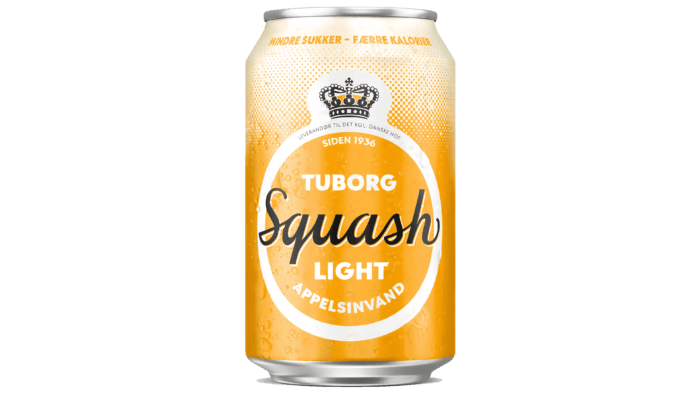
Tuborg Squash with orange flavor has been known to lovers of this drink since 1936. Its refreshing, incomparable taste has satisfied the needs and thirst of any generation of consumers. The creators of this drink were able to convey the unforgettable sensations that Danish soda, beloved by everyone, provided. But besides the taste, this drink was accompanied by an attractive humorous advertisement for many years, which helped make the drink a charming national treasure. But time moves on. And even especially successful brands require updates and changes that must be in line with modern trends to grow and move further in their development. The time has come for Tuborg Squash to please its fans with updated corporate identity, to attract a new young audience that has just begun its acquaintance with the taste features of the product.
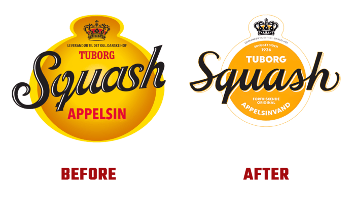
The new design is aimed primarily at a young consumer audience. But his task was not to alienate existing fans but to “tie” them more firmly to the updated brand. However, one of the main objectives of the changes was the need to visually reflect all the benefits of the drink, focusing on its unique refreshing, but not too fresh orange taste and a real “Tuborg” product, which has always been distinguished by its originality, and now even more new and attractive. Given the great historical experience, the brand designers have successfully used the traditions that have developed over the years, among which one of them, the rule of two oranges, has taken its rightful place in visualization. The first orange is the label itself. And the second is hidden inside the crown on the label. Thus, the inexpressible pride of the brand for its legendary past was emphasized. But the most important change was the introduction of “liquid” typography into the design.
The traditional elements of visualization have undergone changes in the modern interpretation, with which they have been successfully and harmoniously introduced into the new identity. All the elements of the past were taken as a basis, which continued to work effectively and was presented again, but in rethought versions. This made the new label more attractive and life-affirming. Graphic lines have acquired playfulness and gaiety. All the curves have become softer, giving some silkiness to their hint of readiness to make a move. Especially original was the introduction of a friendly smiling letter, hidden in the overall graphics of the logo. These details are designed to spark the viewer’s imagination, provide ease of use for visual storytelling, and create an iconic design that looks original and refreshing.


