Tuft, the World brand, began in 2018 when a textile artist, namely fiber, bought the first pile machine. Tim Eads loved this cute and creative endeavor. At home, it turned out to be very simple and pleasant to spend evenings creating beautiful carpets of different sizes. Then the artist’s hobby grew into a small handicraft business; in a short time, he covered part of the West Philadelphia market, and, as it turned out, the demand grew more and more. This meant two things: first, in America, they still value handicraft and soft furnishings; second – it will not work for a long time to be an invisible brand; you need to create a bright and speaking picture.
Turning to Lucy Price and Melissa McFitters, the creator of Tuft explained the brand’s ideology: it is important to show the quality, creativity, and availability of materials, tools that are offered to a potential buyer for tufting. The brand’s approach is ecological, conserving natural resources and believing in the renewal of the planet. Ideas regarding the development of creativity of the population are postulated: more creativity, less harmful consumerism, and other evil for the native Earth.
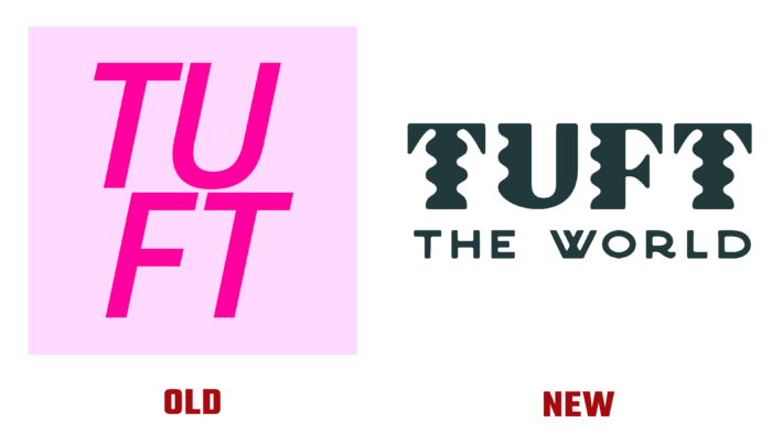
The authors of the new logo reflected the playful nature of tufting. A hand-drawn doodle conveying a soft surface and waviness, combined with geometrized type, conveys the idea of the pleasure of creativity, the joy of being involved in creating something new and original. The curls of the letters in the word “Tuft” resemble tangles of thread or knots on the sidelines that close carpets. There is no trace of the gently pink square in which the word was originally inscribed, divided into two groups of letters brighter than the square itself. Now the square has sunk into oblivion, and the arrangement of words has changed. Moreover, a large-scale “the world” has been added, declaring the scale of the business.
Successful and striking rebranding, despite the lack of a catchy palette. The main quality of workmanship and the quality of the goods sold.


