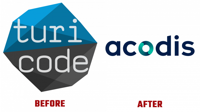
The world-renowned SaaS software provider, the Swiss company Turicode, has announced its name change to partners and consumers of its product. Now brand awareness will be determined by a more laconic and attractive logo with a new “name” – Acodis.
As one of the modern trends in the field of web technologies, the SaaS model is becoming one of the most demanded technologies in the provision of services in the field of cloud computing. The simplest example of such a form is email. Traditional options require a large staff of service personnel. The use of SaaS service allows you to significantly reduce maintenance costs, increase security, providing fast, intelligent automation, convenient synchronization, and comfort in multi-user work due to cloud storage. The service already recognizes and promotes fast and high-quality digitization of files with a pdf extension, scanned texts, images, and letters received by email. At the same time, there are no language barriers for him to read any document.
The service is very promising – project management systems, organizers, or remote online document flow. And this is just a small part of what can be simplified and accelerated in the user plan using SaaS. Machine learning of the service is especially important given its high performance. For this reason, innovative developments in the field of creating convenient forms for the online processing of documents are especially important today for users of any level and the specifics of their work.
To easily convey such important information about its product and its manufacturer to its potential user, the company decided to conduct a rebranding based on marketing research, taking into account the latest achievements in self-promotion. Thanks to new design principles, an innovative approach to consumer psychology, and a clear presentation of information for the best visual perception, a new image design was created, and the company was renamed. The laconicism of the emblem – the inscription is made on a white background in black font, contributed to the correct placement of accents, drawing attention to the name, its central letter.


