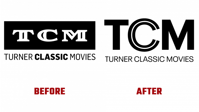
Turner Classic Media, owned by WarnerMedia, has unveiled the new design for the first time in seven years. The rebranding was entrusted to a design agency based in New York, Sibling Rivalry.
The new visual image is accompanied by the slogan “Where then meets now,” which conveys the idea of the narrative of the cinema of the 20th century in the era of modernity. The credibility and respect that the company has gained are reflected in the brand’s new style.
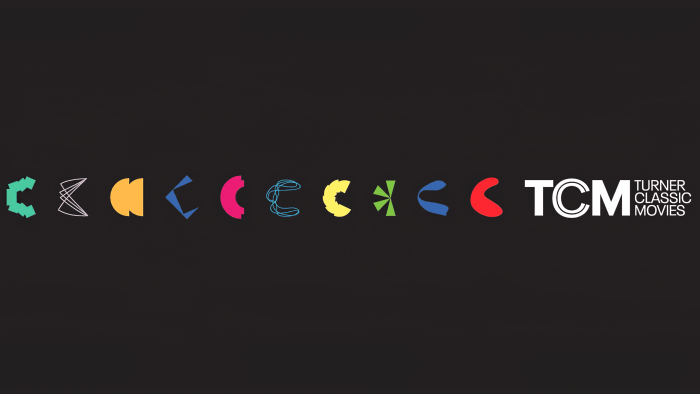
The visual identity has a fresh color scheme, and the logo is in a modern font. The letter C is depicted in different shapes and shades to show the dynamics of the development of cinema in statics. The stylizations turned out to be more than successful because when you look at them, you desire to look at the letters even longer and offer your options. It is interactive, which is necessary for such an area as the film industry. Interestingly, the animated C is divided into a double C in the screen version, which reflects the modern attitude towards classic films. This is followed by the four Cs that reveal the four principles of Turner Classic Media: culture, context, curation, and coherence.
Like ten different genres of films, ten different Cs perfectly illustrate the spirit of cinema, its dynamics, statics, and the ordinariness and non-triviality of life.
What the designers were striving for – to show the transformation – was 100% successful. The white postscript on the right TCM Turner Classic Movies balances the contrast of the Cs on the left side. An interesting and unusual visual solution for a company that never ceases to amaze.


