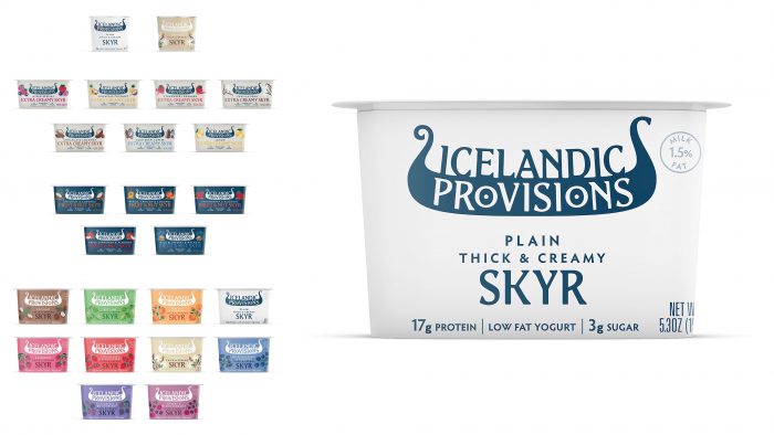
The Icelandic Provisions brand of Icelandic dairy yogurts has been delighting its customers for six years. This is generally considered exotic in America because the specific technology of preserving yogurt, the preparation procedure, has been a continuous authentic highlight of Iceland for 1000 years. With partner brand, MS Iceland Dairies, the oldest and largest dairy concern since 1929, Icelandic Provisions has exclusive rights and a recipe under wraps. Interestingly, the production of an interesting dairy product takes place on farms owned by individuals, or rather families, and all this happens thanks to the artificial cultivation of dairy crops with hormones. Yogurt varieties include the traditional recipe, extra creamy, fruity, nutty, and many more.
New packaging this year came with a new logo designed by Turner Duckworth.
The main task was to show the Icelandic character of the products. This was done by representing a typical Scandinavian boat: the image is held by the word “Icelandic,” and onboard the Viking boat is depicted in white letters “provisions.”
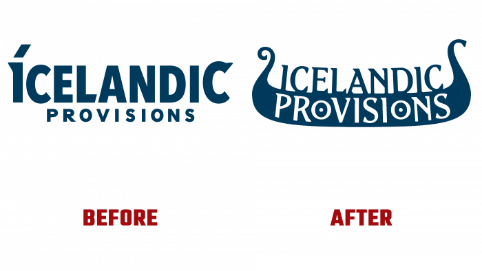
Previously, the logo was simpler, although the idea of the boat was visible too. The letter I had a slanting line, like a point, only of a square shape. The graphic itself ended with the letter “C” with a serif. And the inscription itself with the name of the brand was in different fonts; the trademark sign was attached.
The current logo is beautiful, flowing, illustrating the national character of Iceland and the originality of the products presented on the American market.


