The new Nubank brand entered the market in response to the concerns of modern society. Combined, financial bureaucracy, absurd rates, and disgusting service have made customers reluctant to establish relationships with banking systems. People have lost faith in honesty, sincerity of communication, and reliability of the services provided by modern banks.
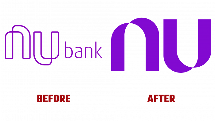
After eight years of high-quality work, the brand made a huge leap of faith – the era of digital modernization to renew its visual appearance and become even closer to its dear audience. The path traveled, return, engagement, brand maturity, and the prospects for big business are invested in a new visual that perfectly matches their positioning in the market.
Reflecting the real needs of its customers, Nubank has created a beautiful, user-friendly, and attractive design that will make anyone fall in love with it.
The basic concept of brand identity is to show what is behind blank numbers. This is not money, not connections, not power. This is a brand about people and their values, hopes, discoveries. Easy-to-use products, trusting customer relationships, favorable rates, and excellent service are at the core of Nubank’s business.
The daily life of 398 million people is not just words. It is a huge living organism in the physical world and digital dimension with all its advantages and disadvantages. Humanizing a service means showing how important and valuable each user is to the company. Therefore, the initiators of the rebranding caught up to the smallest details of the milestones of our time, which the clients cherish; they were able to prove that the change in the bank’s image is not just a change in color and shape. This is the translation of new meanings through design communication.
A pleasant lilac color and smooth curves that form a graphical NU connection became the symbols of a better life and upcoming financial discoveries. The sleek, rounded lettering impresses the user and instills confidence by showing humanity and goodwill. There is a feeling that the logo is moving, does not stop developing.
It was not for nothing that the designers chose just such a shade of purple. It encourages, balances, soothes. It also highlights the lettering, which makes it more convenient and readable in different media.
As the representatives of Nubank say about themselves, the financial solutions platform strives to satisfy the needs of customers. Therefore, the new logo and the chosen colors indicate that the brand has room to grow; it is full of energy and ideas that it would like to implement in dialogue with the target audience.
Rebranding was a necessary step to improve the service, which led to a wave of positive changes in the company’s strategy and increased interest in the company. This speaks of the importance of revising values and concretizing the development vector for any company, be it a small business or a huge company with hundreds of people.
The new design is softer, kinder, more loyal to customers. Therefore, as they say, how you treat people, so they will treat you. Well, the Nubank brand will undoubtedly have success and a new wave of joining users.


