In early November, creative agency Output unveiled a new identity and corporate identity for Tutorful, an online learning company.
This is not to say that this brand has done something unthinkable in online learning, but what its style has become is innovation, real creativity, bright joke, and joy for all service users. Without a well-built marketing strategy and rebranding plan, a brand cannot achieve such success and brightness.
In the UK, this platform appeared in 2015, when no one was surprised that online courses and distance learning were becoming accessible and interesting for pupils and students. Someone wanted to improve their language, someone specific subjects or discipline courses. But because it was Tutorful that quickly attracted the attention of a wide audience, at the moment, the company is considered the largest leader in the online services market.
By the way, in 2023, the global online learning industry is expected to be worth nearly £ 50 billion. The market is growing, gaining momentum, and more competitors are appearing. Therefore, such a brand needs to be in the thick of events, follow trends and adapt to changing cultural events.
Digitally reflecting the brand values for Output was not difficult. The new design is based on the idea that children do not have enough simple learning at school; they need support from parents and tutors, they need to ensure the child’s future success with all their might.
Each child learns in their way, so it was important to preserve individuality, creativity, positiveness in the new design and show how easy and fun learning can be so that users are not afraid of any possible obstacles.
The upward trajectory of development as a concept is embedded in the brand’s logo in the form of a stick with the letter T.
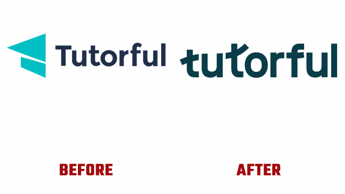
In the early days of delirium, the logo focused on the idea of showing learning through the image of a graduate cap. Also, this symbol looked like a rolled-up piece of blue paper. The title was written in a simple navy blue sans serif font.
The current logo does not have a capital letter, it is created from lowercase letters, and the letters t with dashes in the middle show the growth, flight, rise that users make thanks to their knowledge.
Also, to change the logo and online center components, changes were made to the website, full-screen designs of key pages were presented.
In general, analyzing the new image of Tutorful, we can say that the designers organically and unobtrusively showed the prospect of student growth thanks to the platform. There are no unnecessary elements, unnecessary bright accents. Everything is strict and creative at the same time. For positive learning outcomes, there should be no accompanying distractions in training. In this case, the logo’s success depends on how harmoniously they managed to show modernity, flexibility, integrity in one graphic object.
And looking at the new logo in a dark green emerald hue, we can confidently say that other elements of the updated design will only accompany the company’s development and attract new users. Each element has a heart, a positive attitude, and joy from the creation process. Therefore, such a message through the design will indulge students without fail and become a great help in learning.


